Modeling & Materials

Weekly Activity Template

Yanyou Wang


Module 2


For this design challenge, I explored different indoor and outdoor spaces at Sheridan College to understand how spatial design influences students' daily experiences. I documented study areas, hallways, seating arrangements, signage, and outdoor landscapes through photography. During my observations, I focused on how these spaces support navigation, accessibility, comfort, and social interaction. I also considered the purpose behind different design choices, identifying both effective features and potential opportunities for improvement. This exploration helped me better understand the relationship between physical environments and user experience.

Design Challenge 1
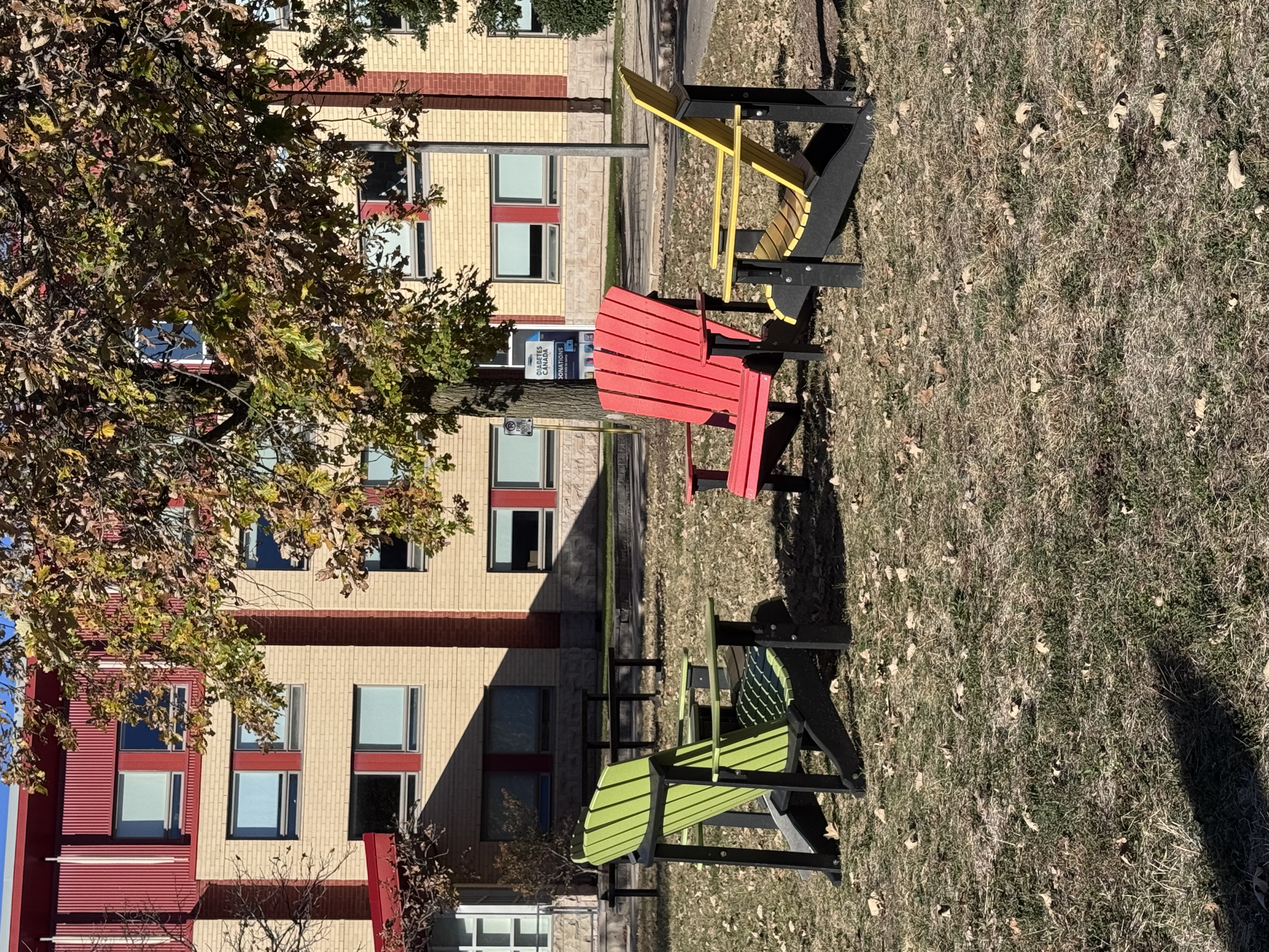
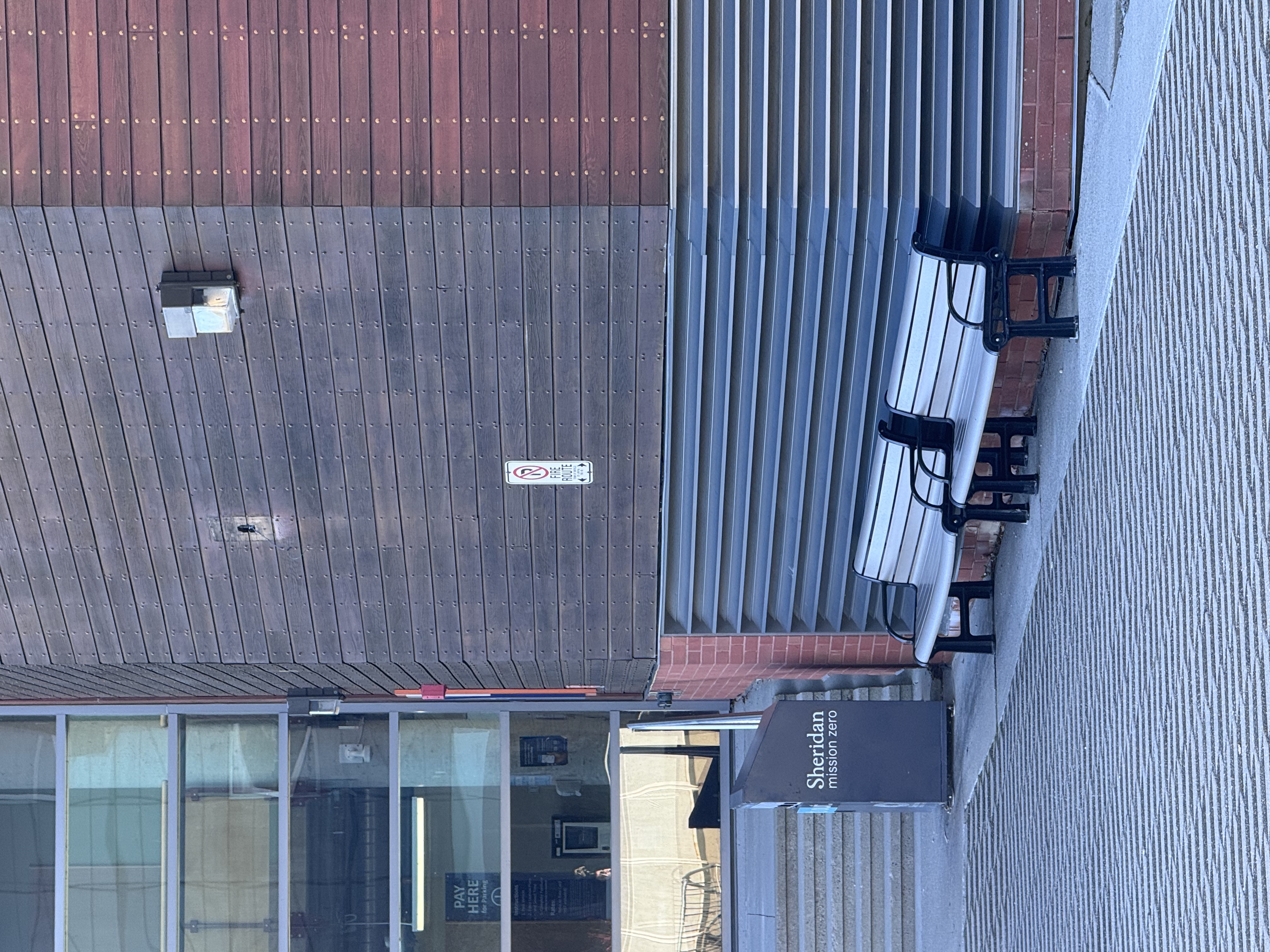
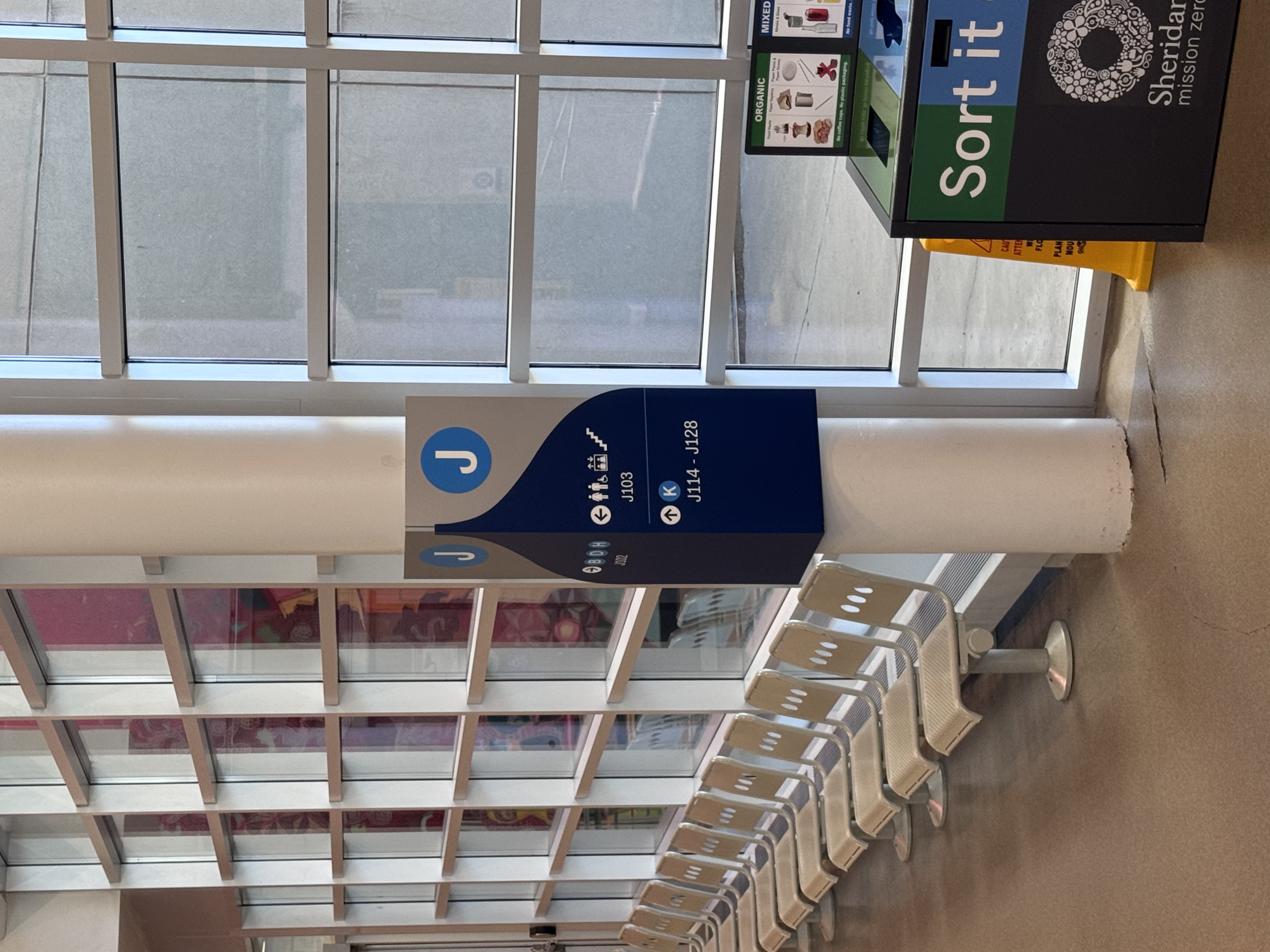
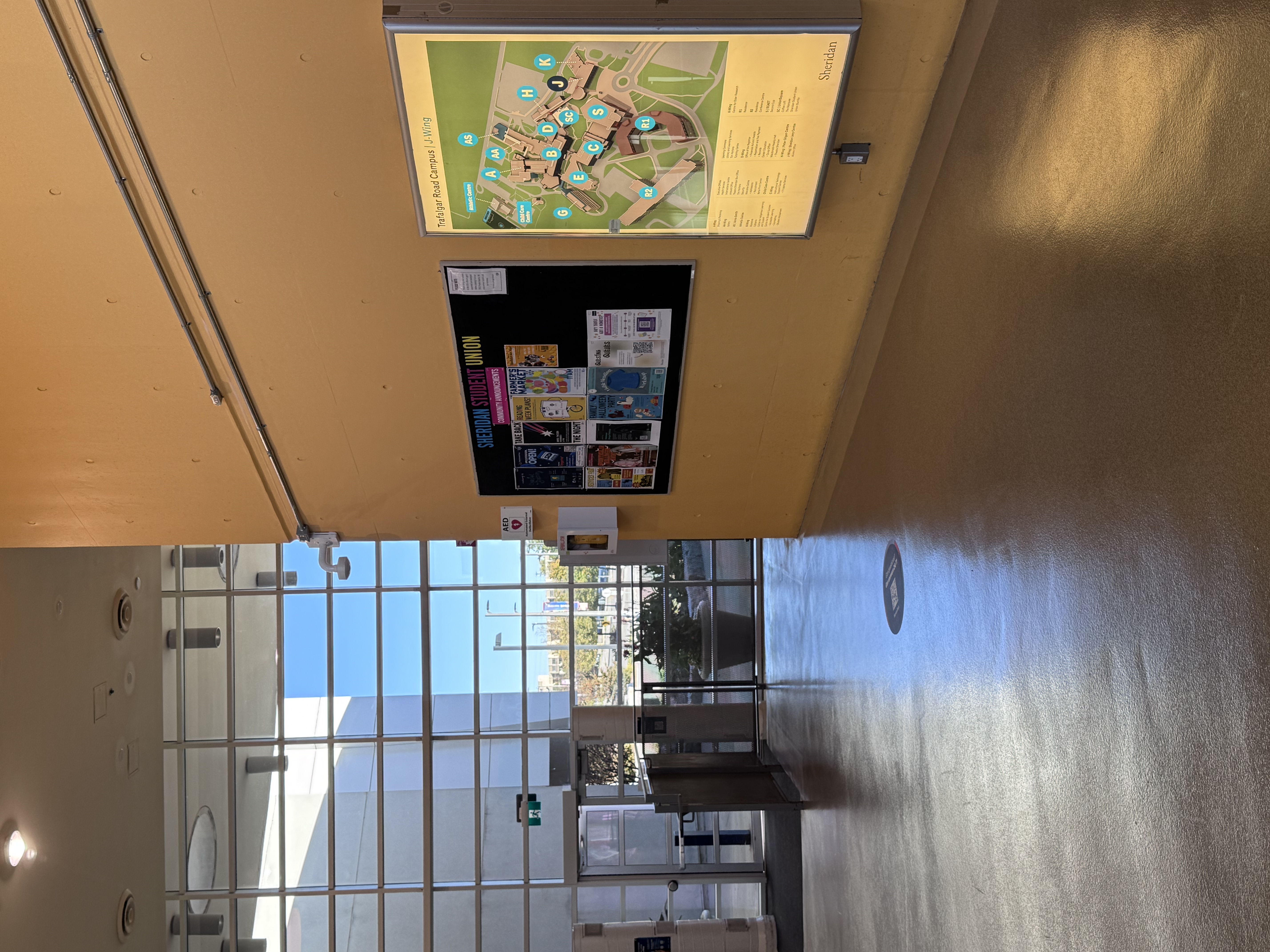
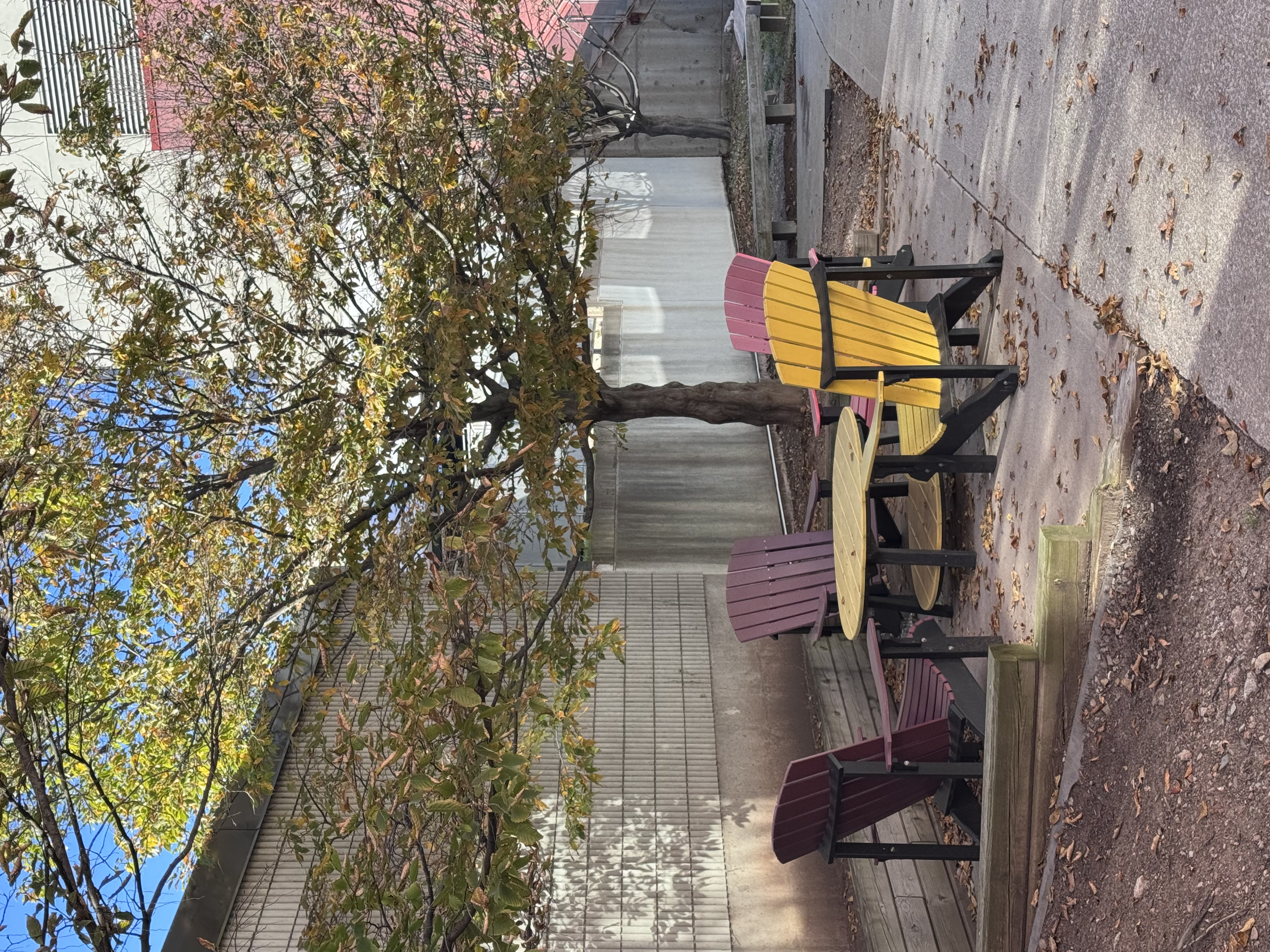
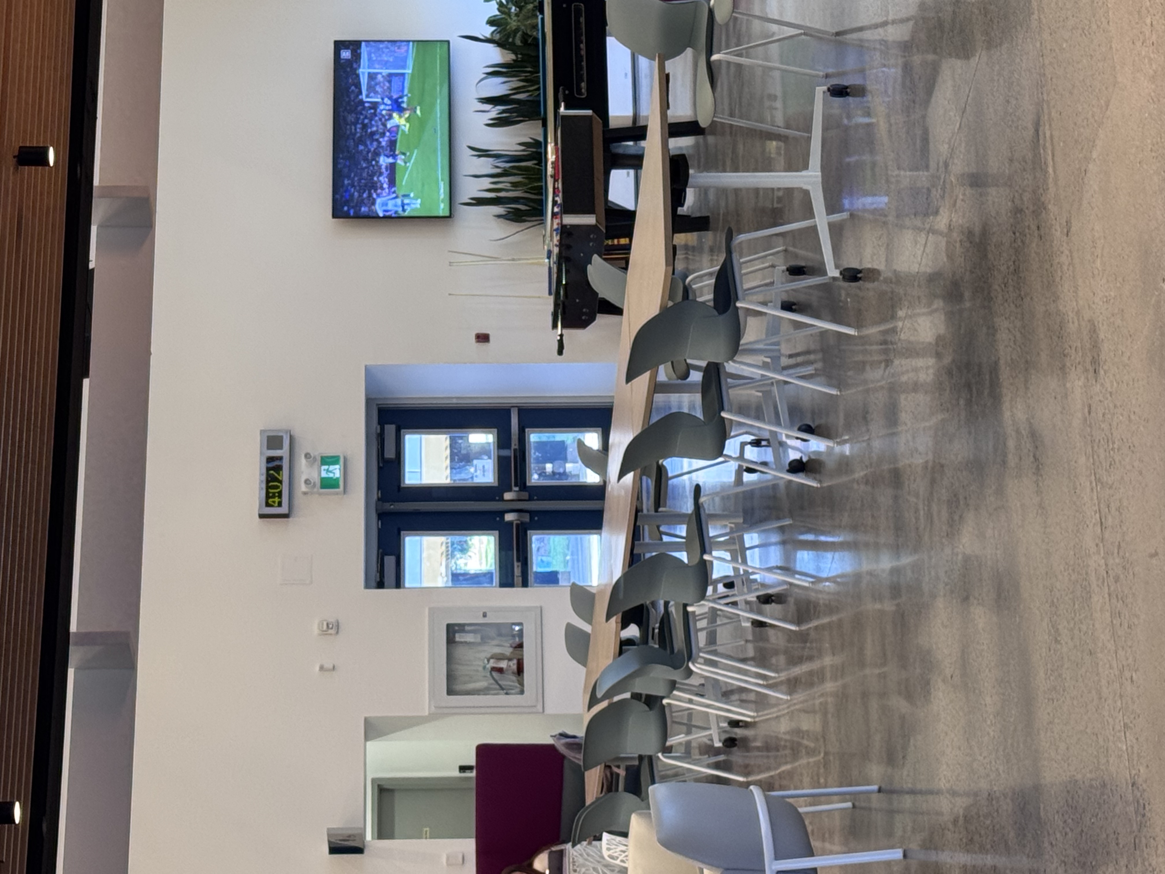
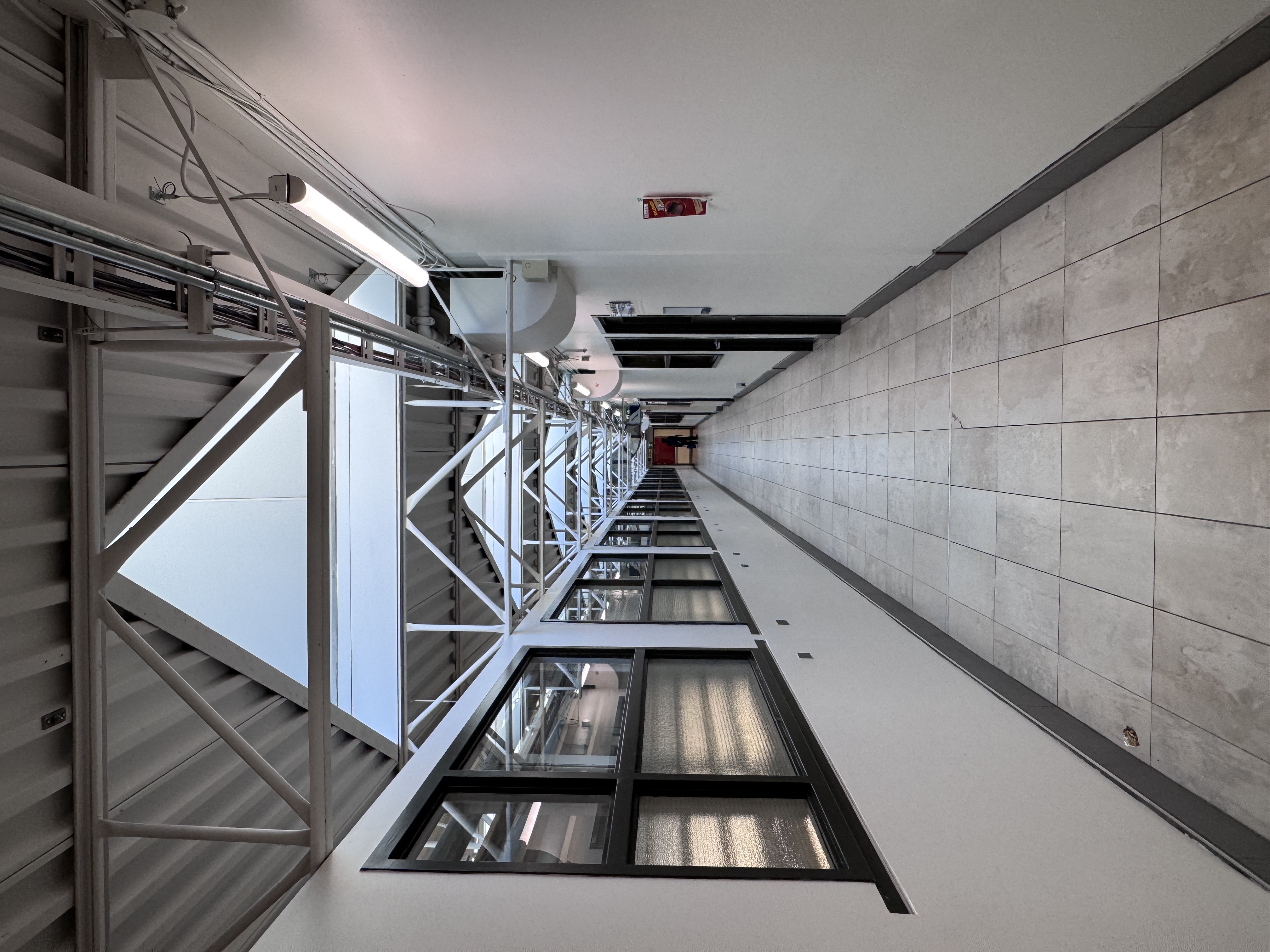
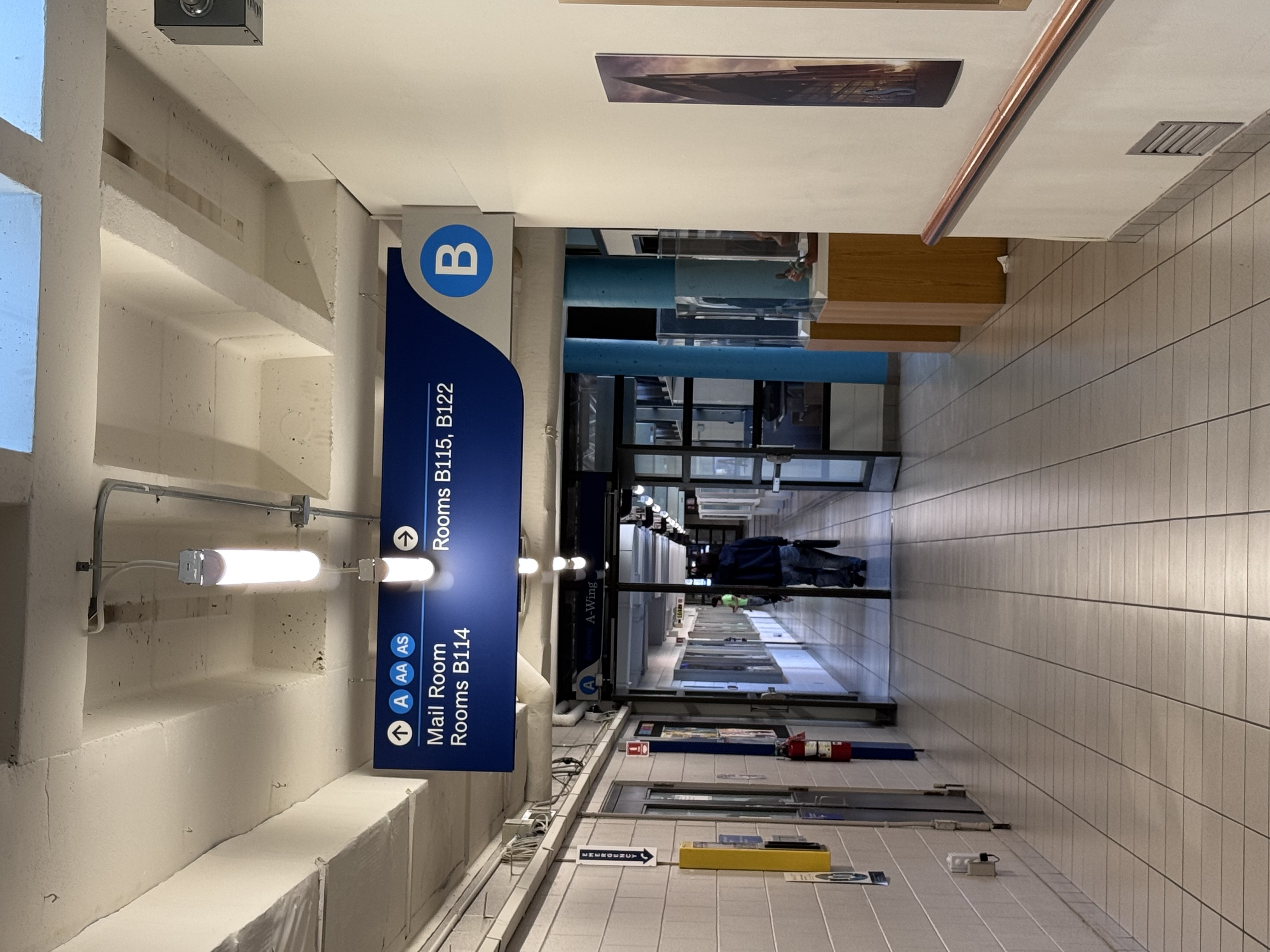
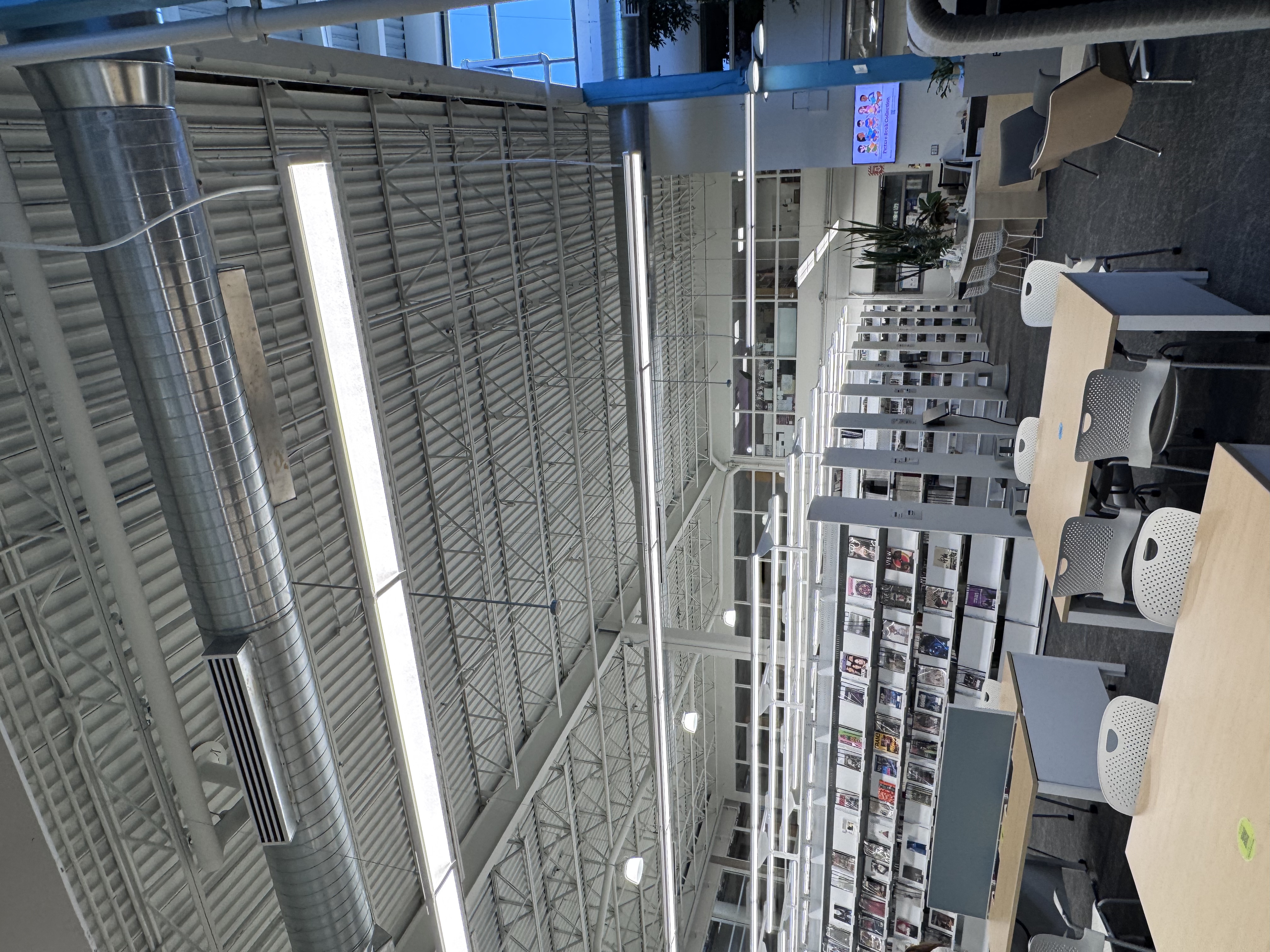
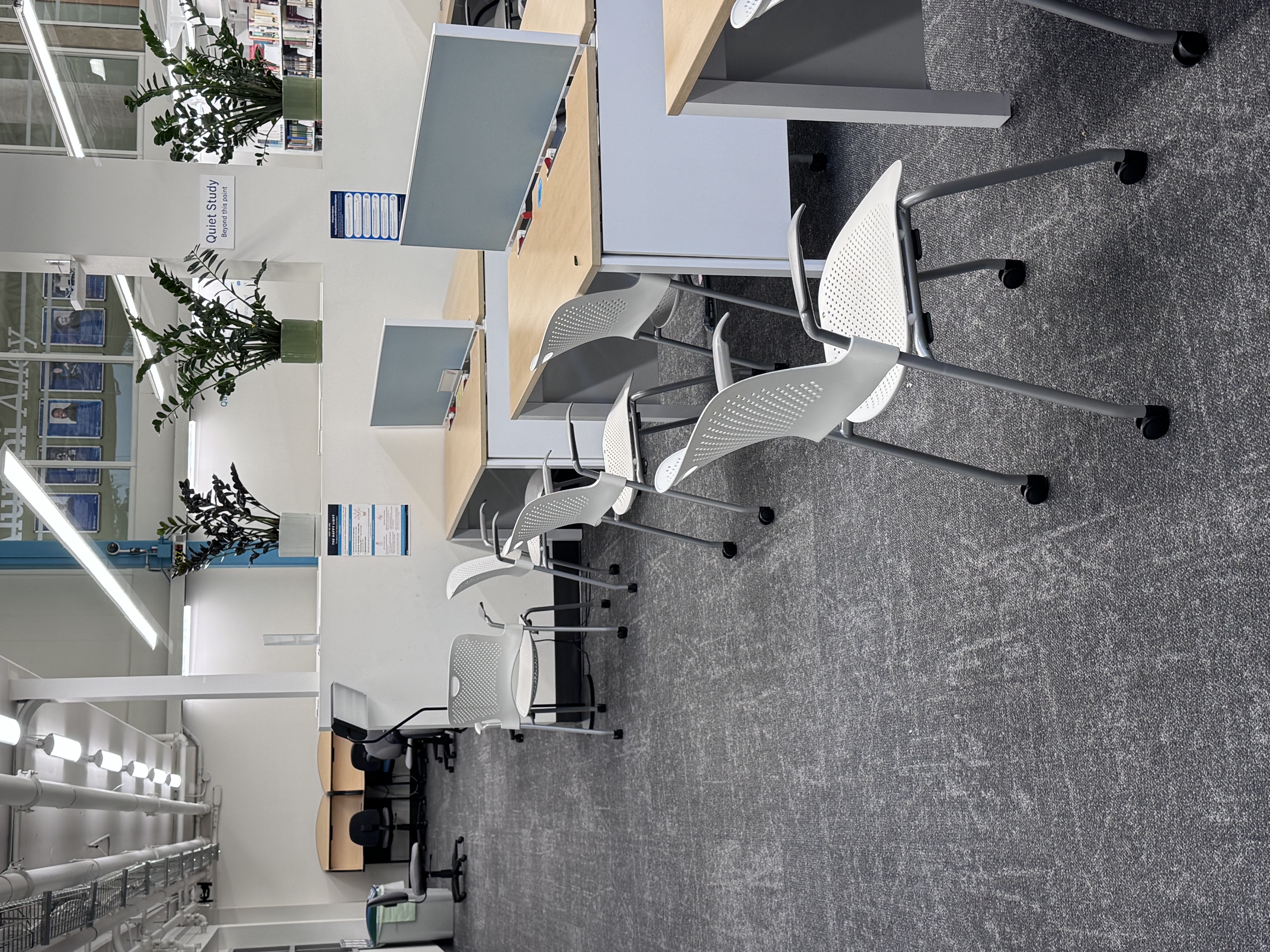
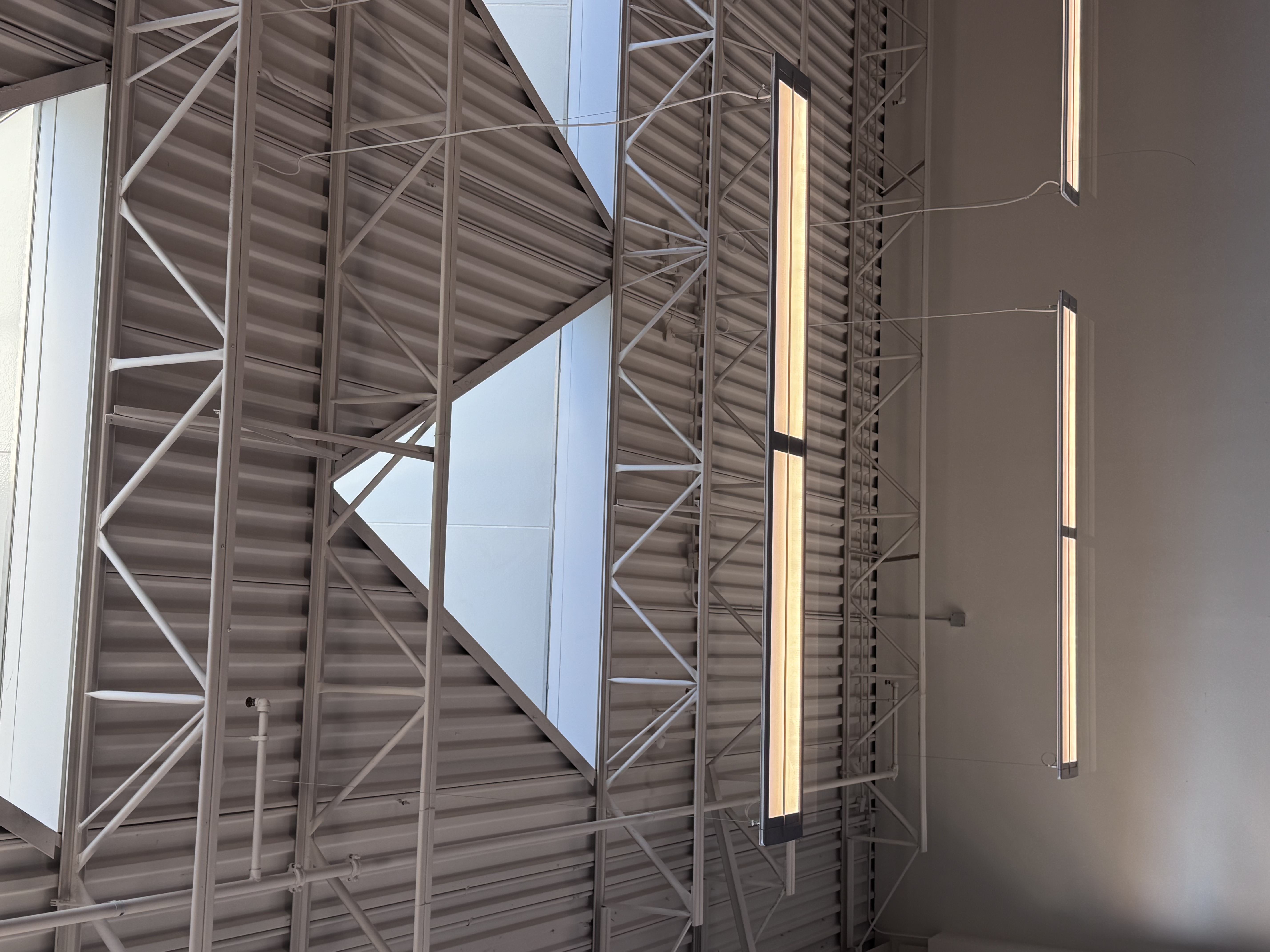
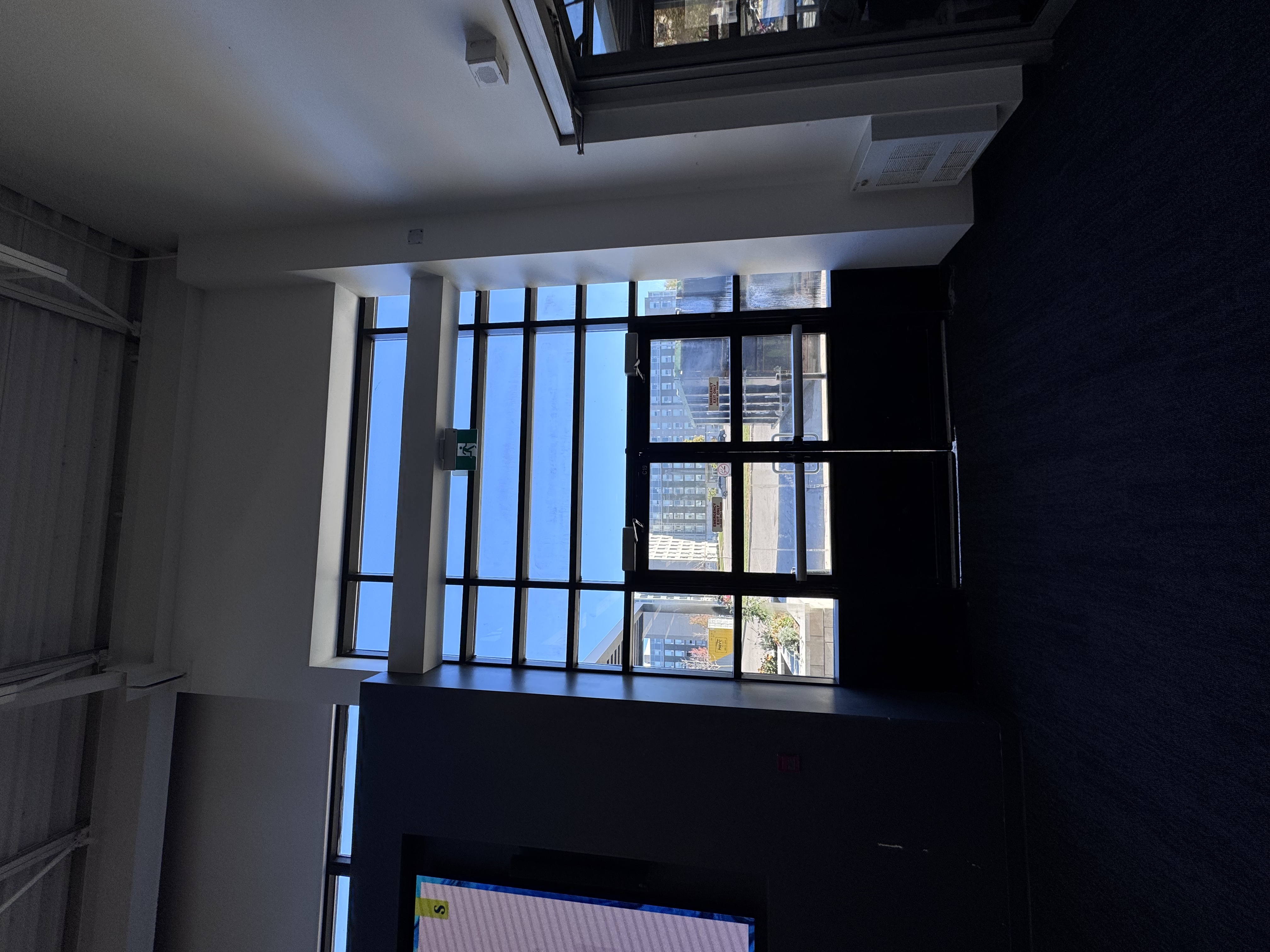
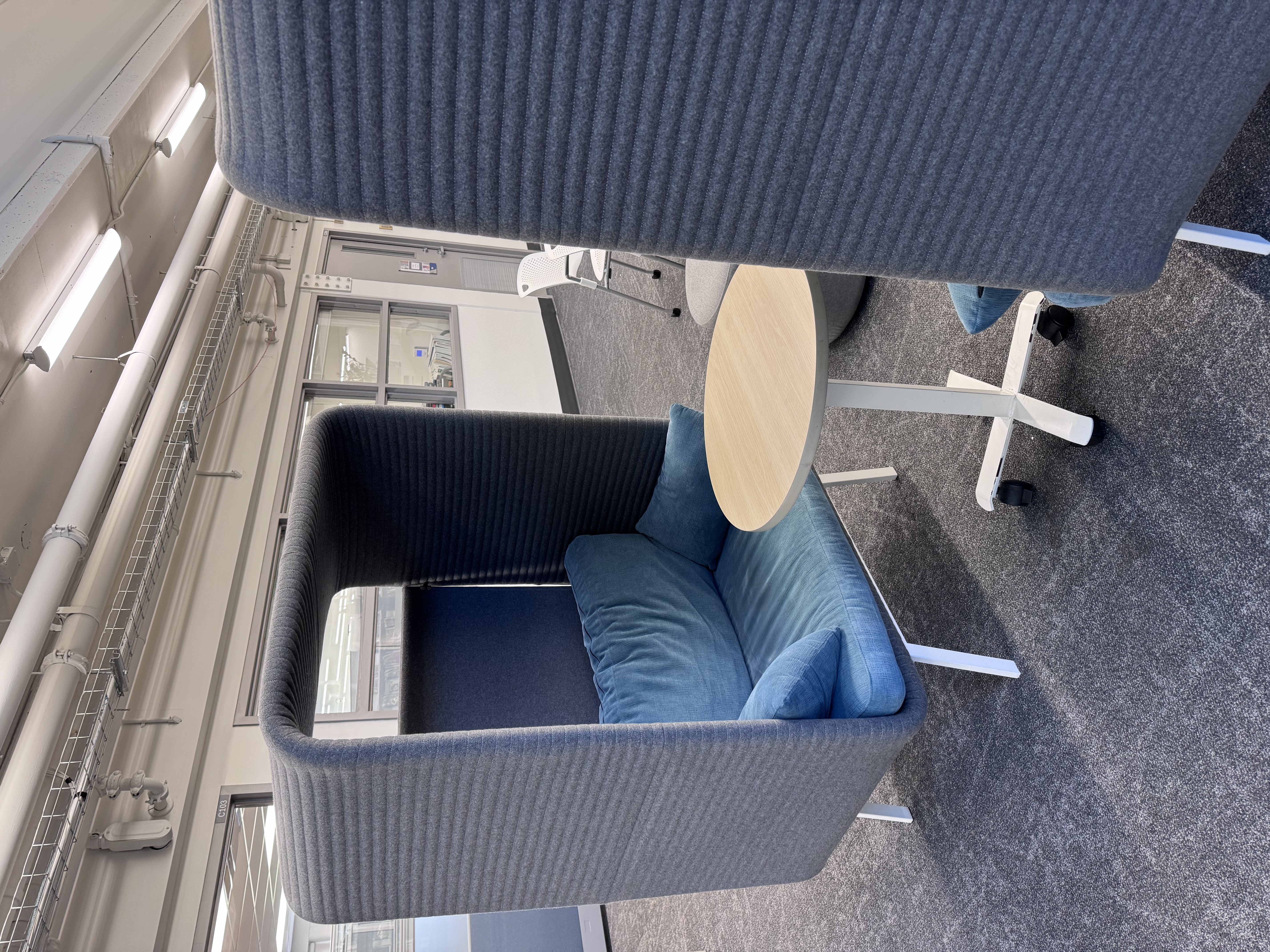
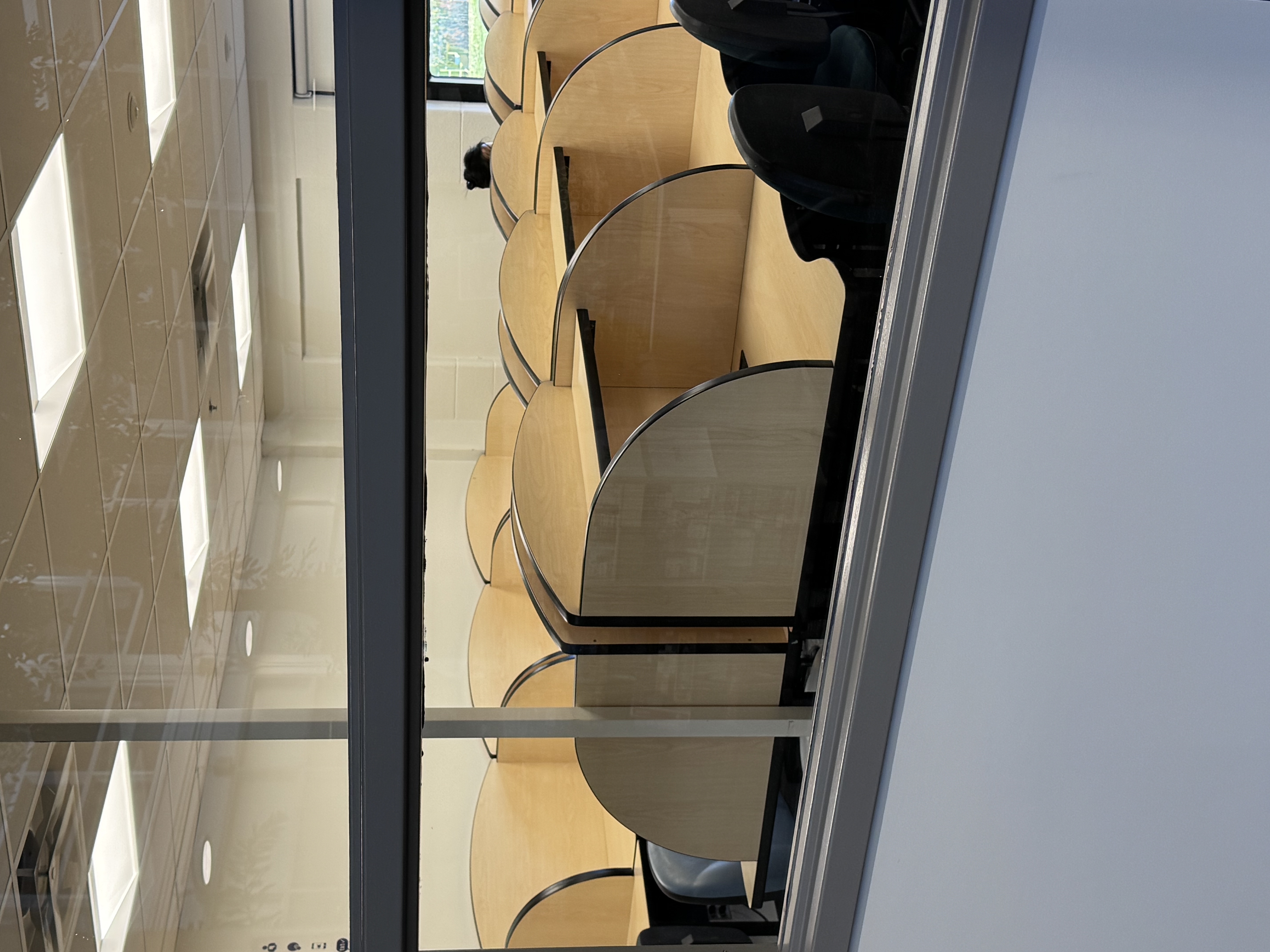
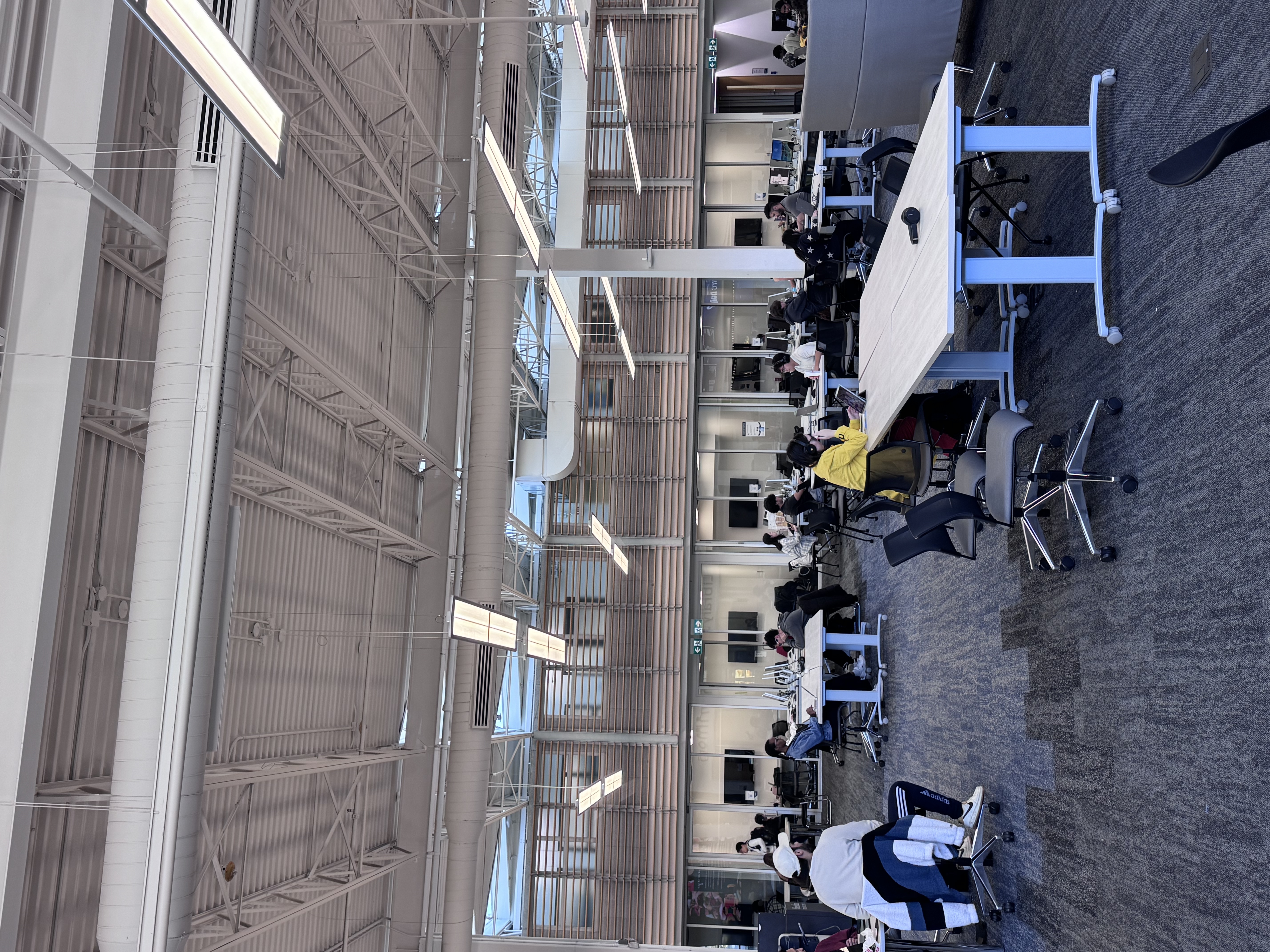
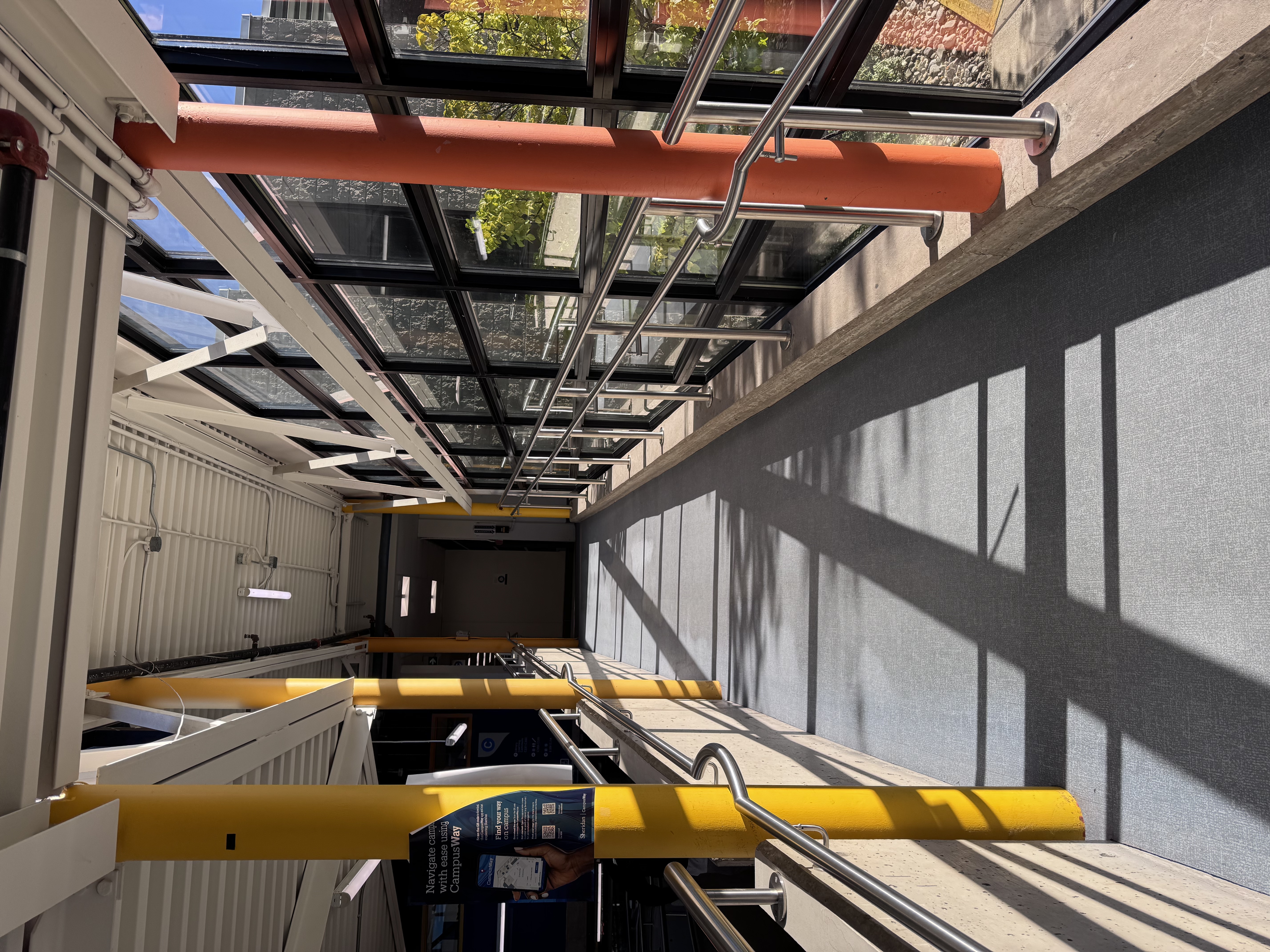
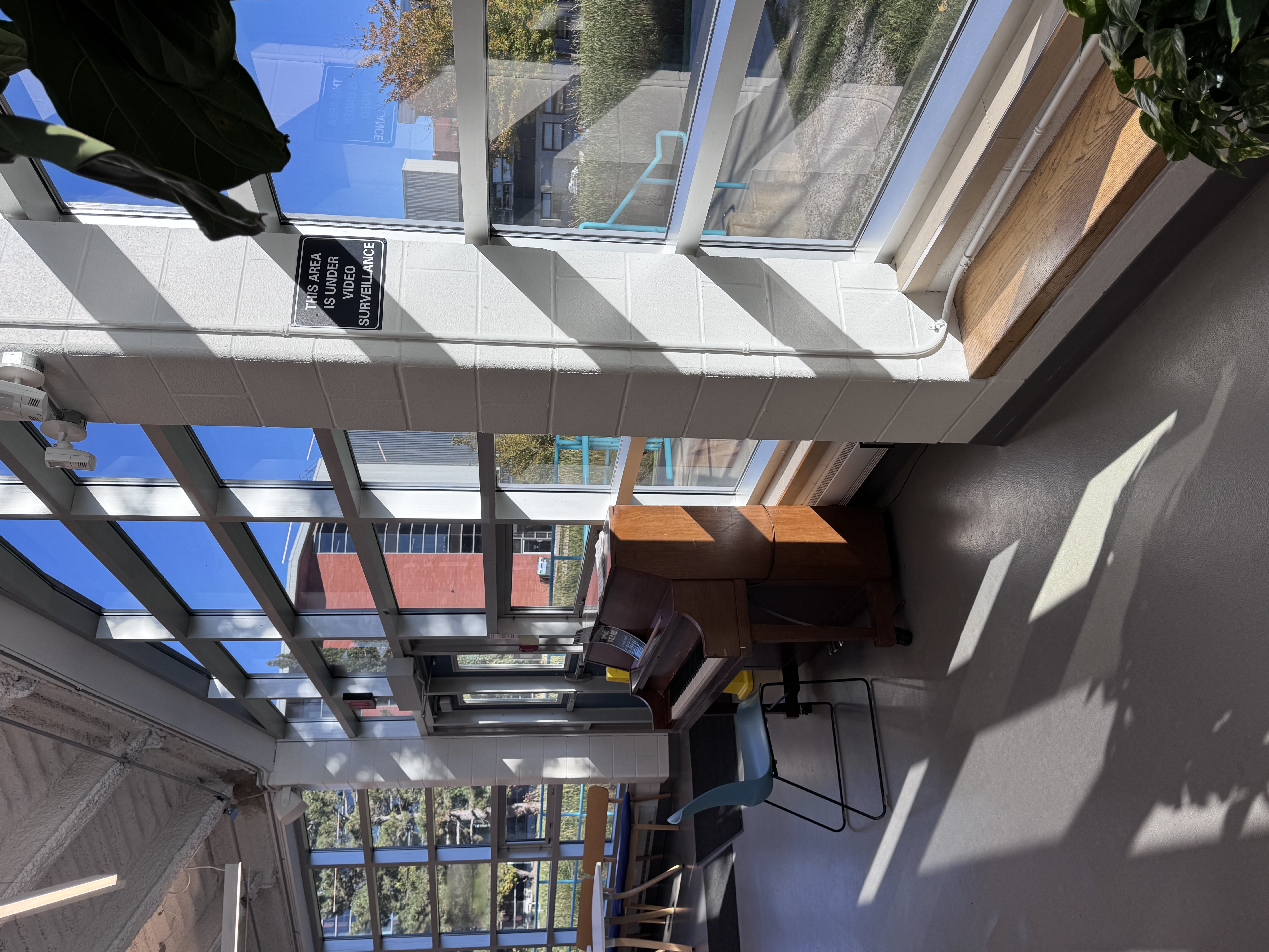
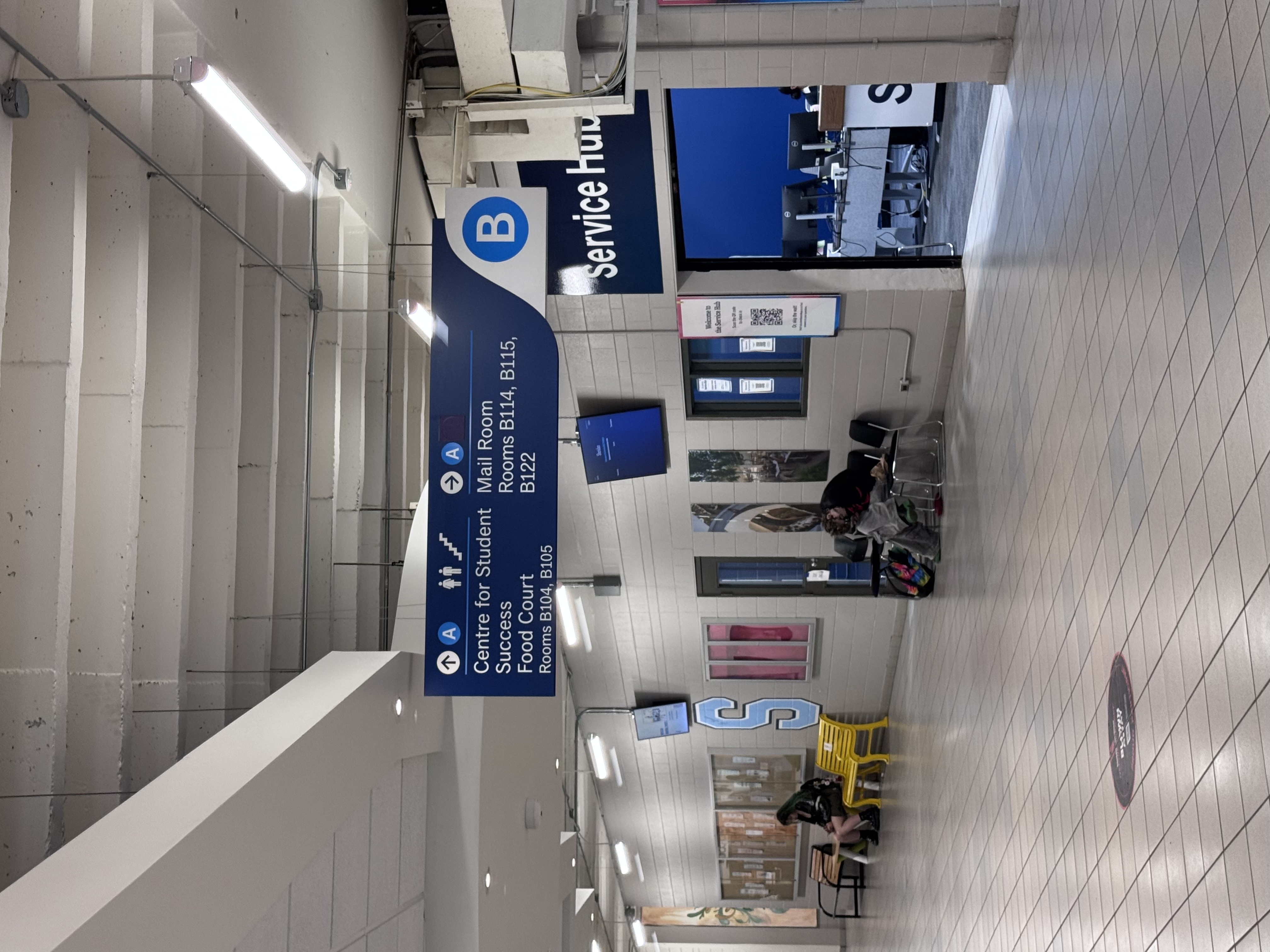
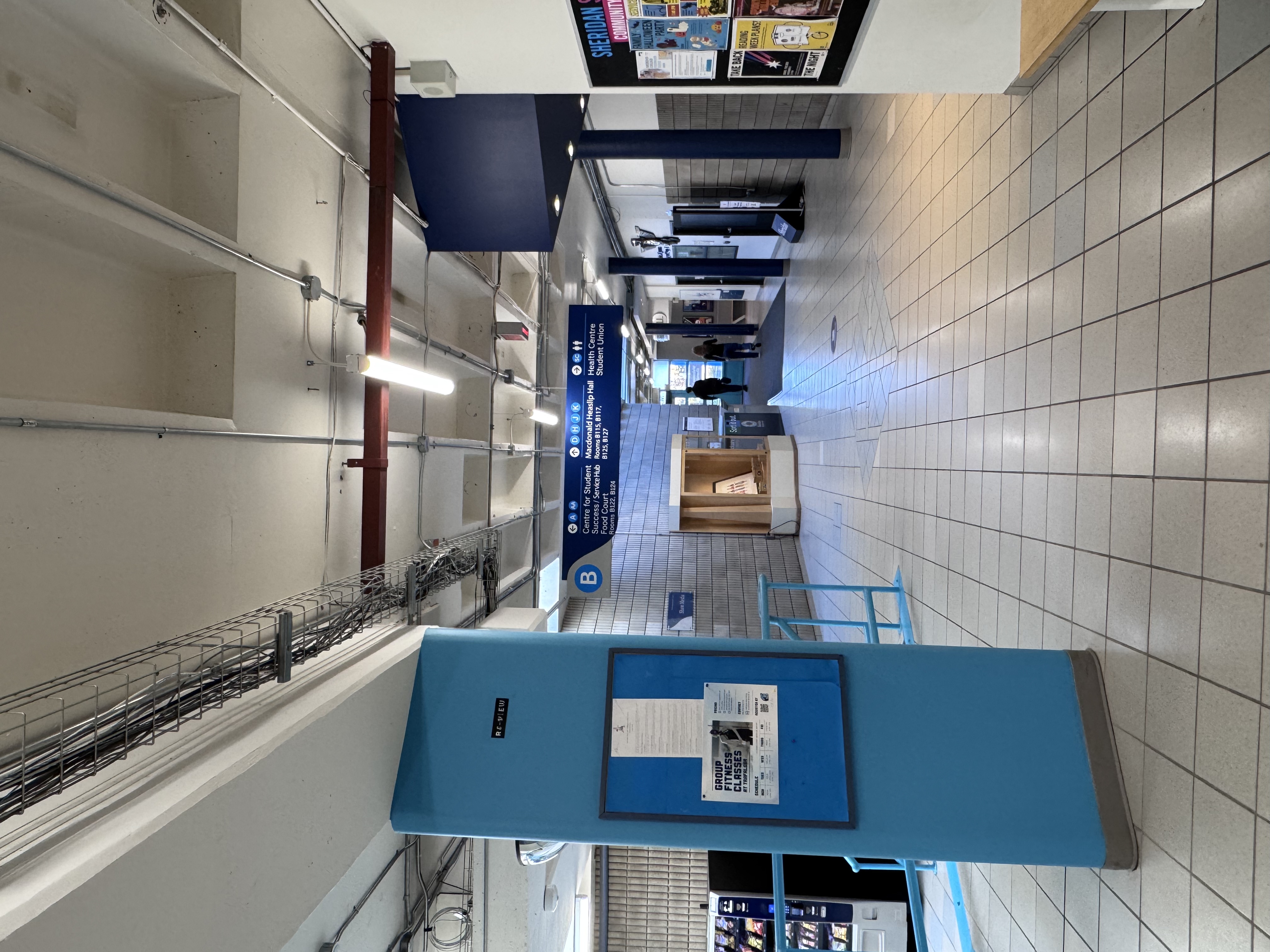
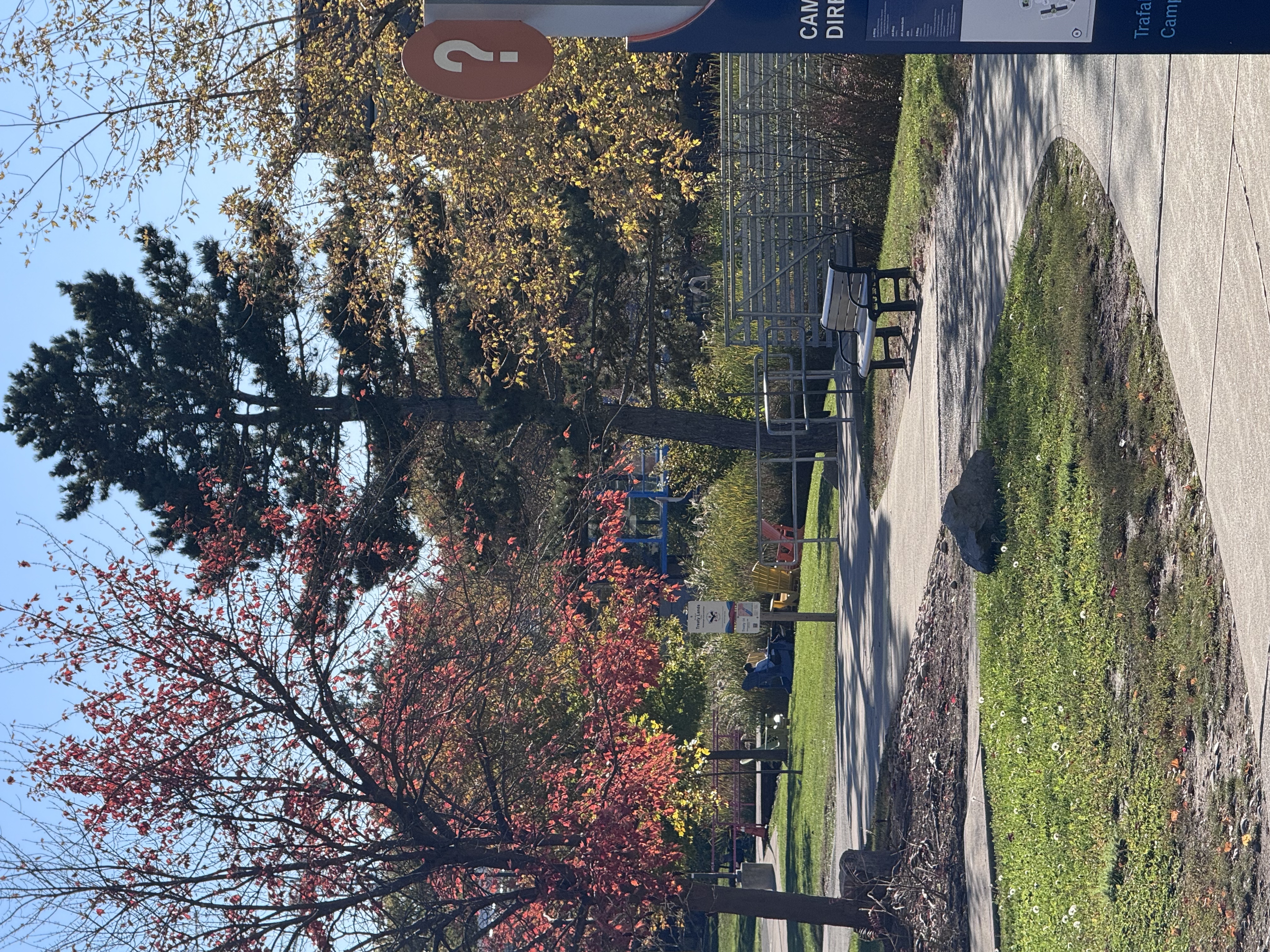
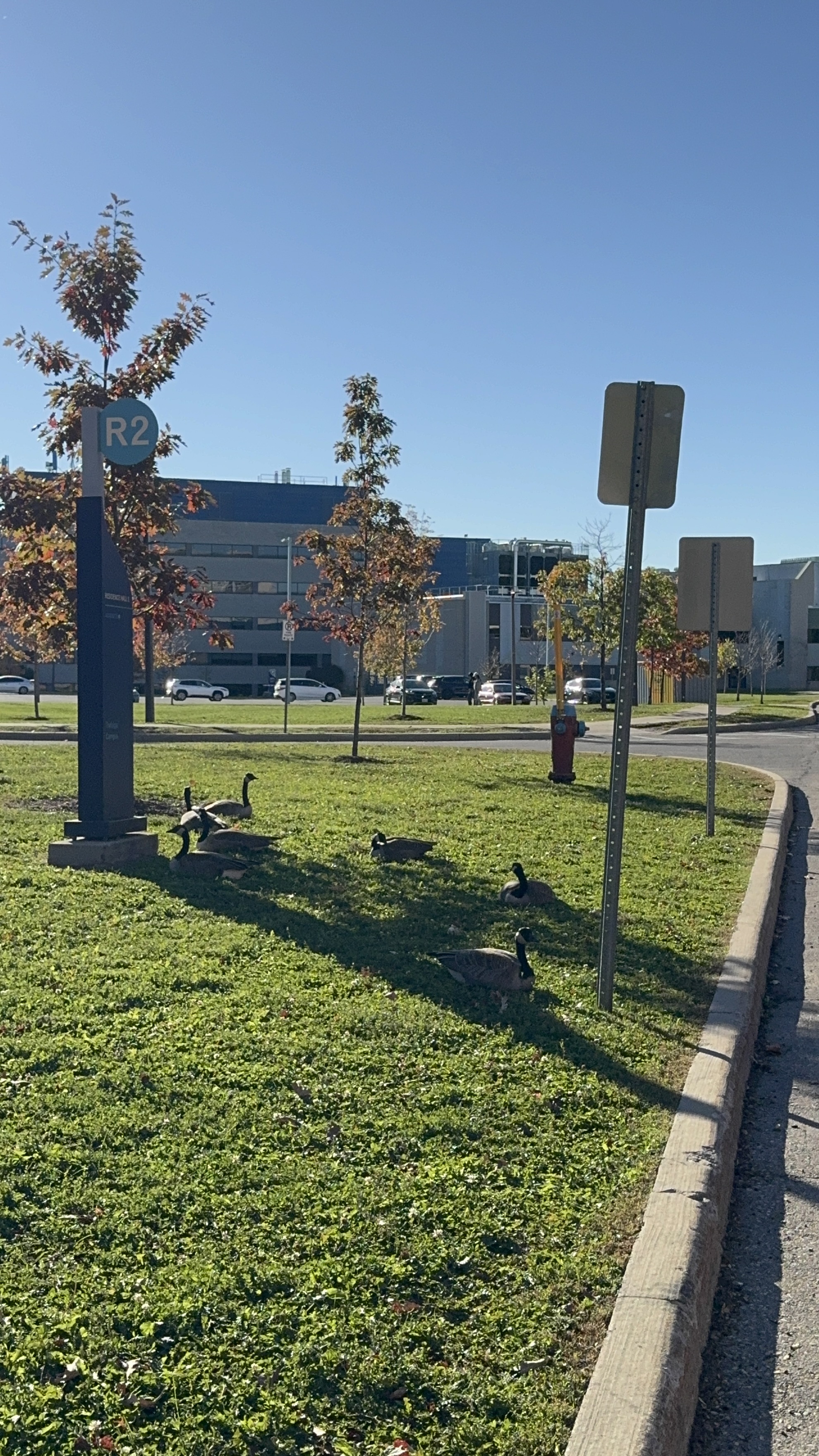
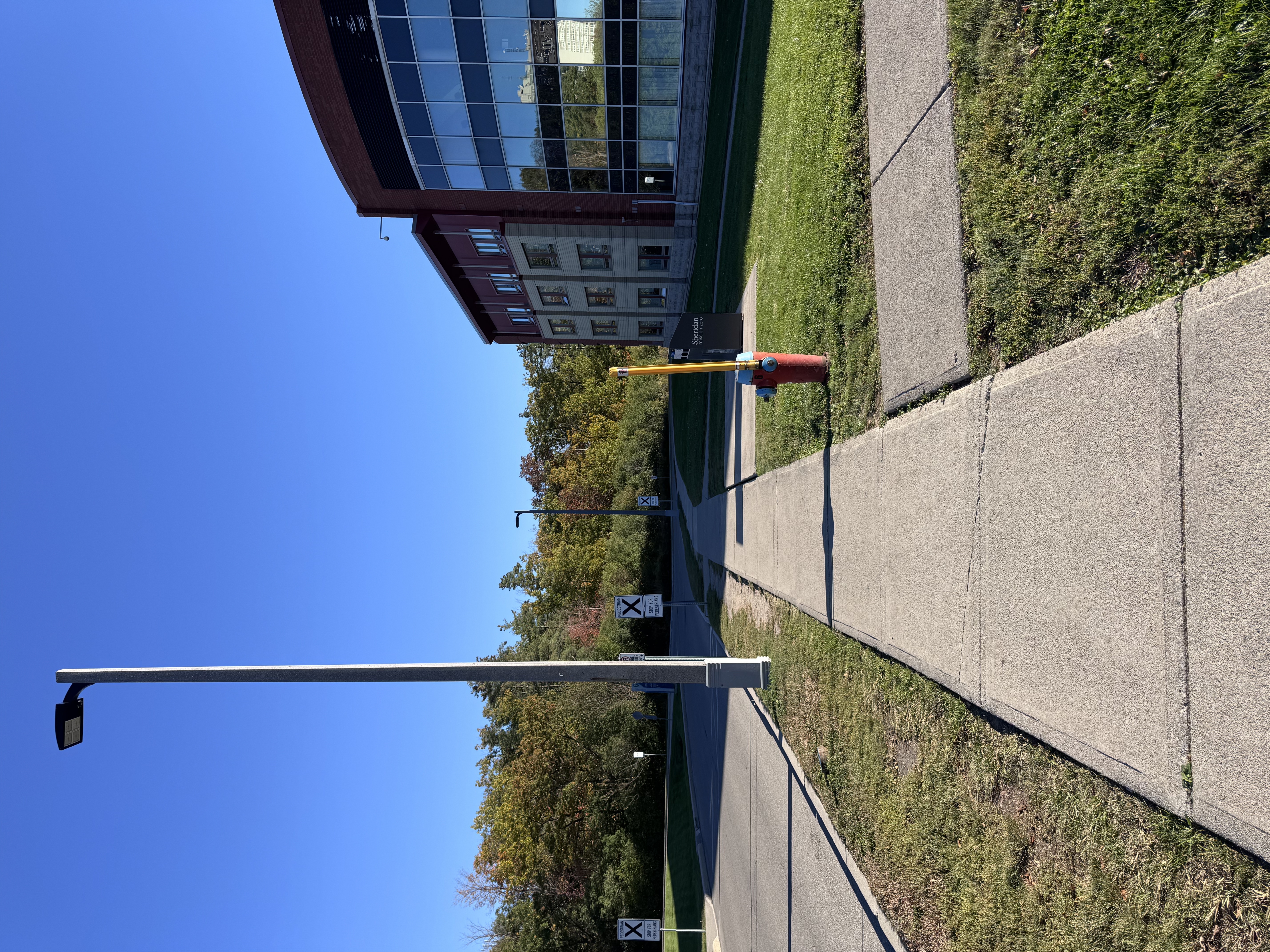
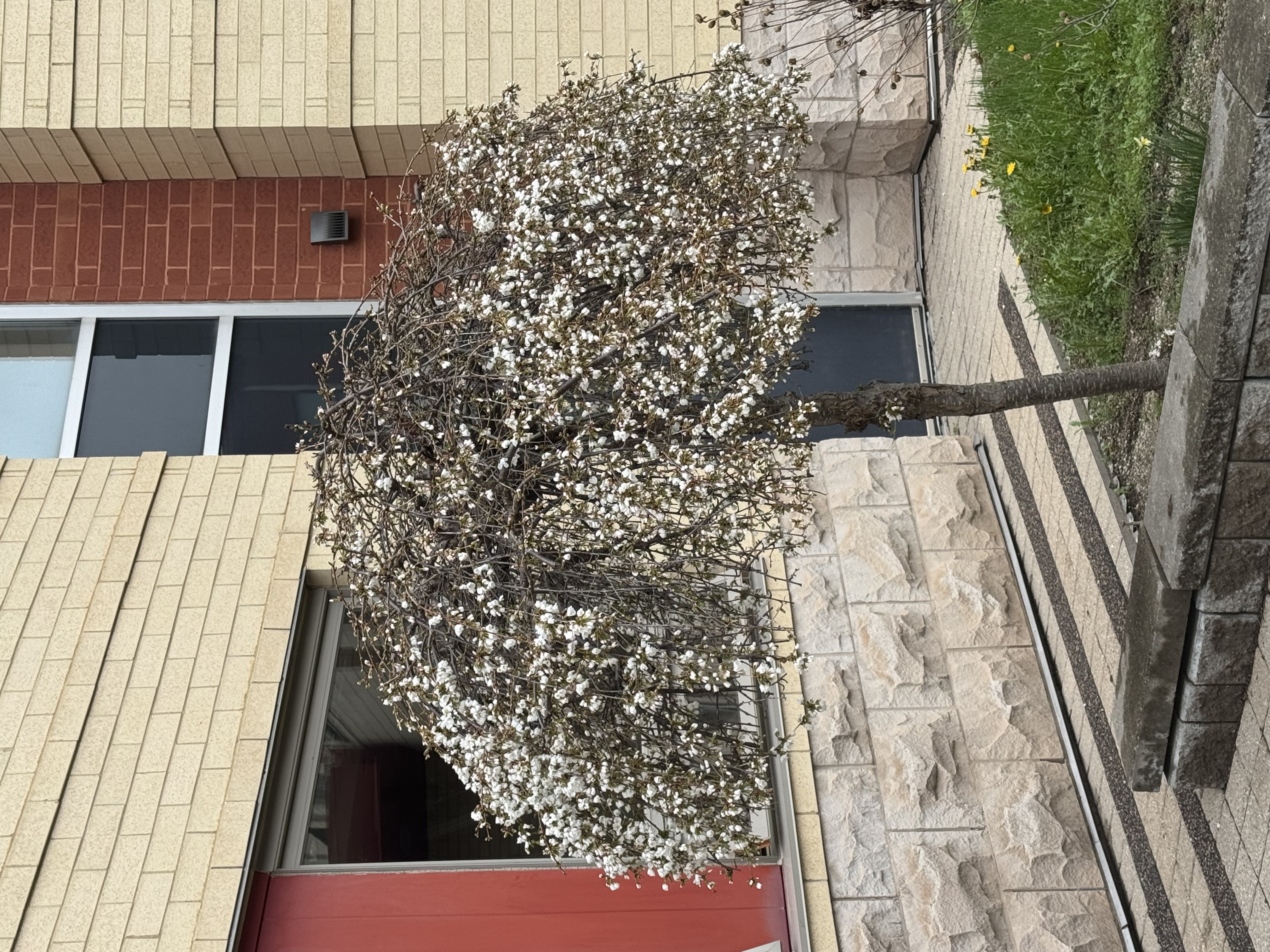
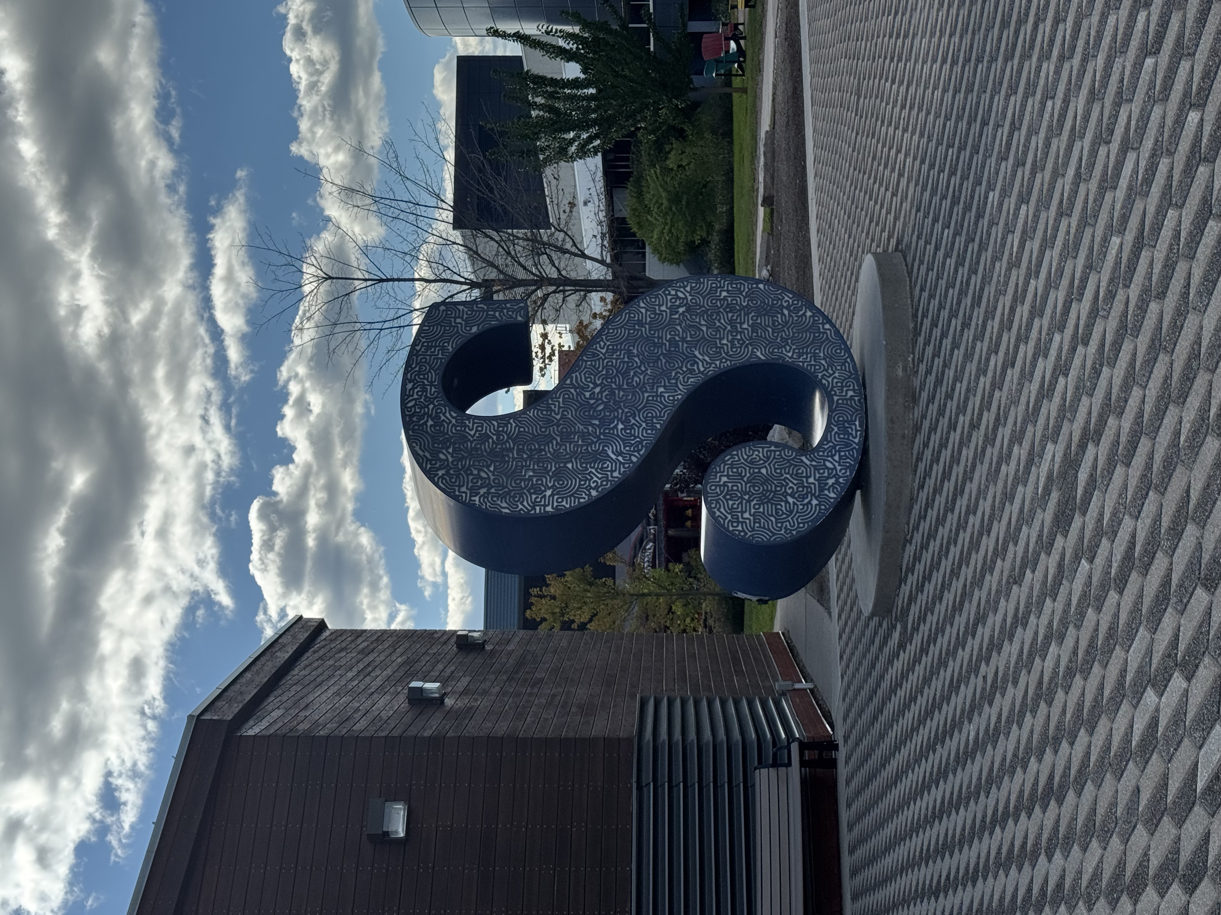
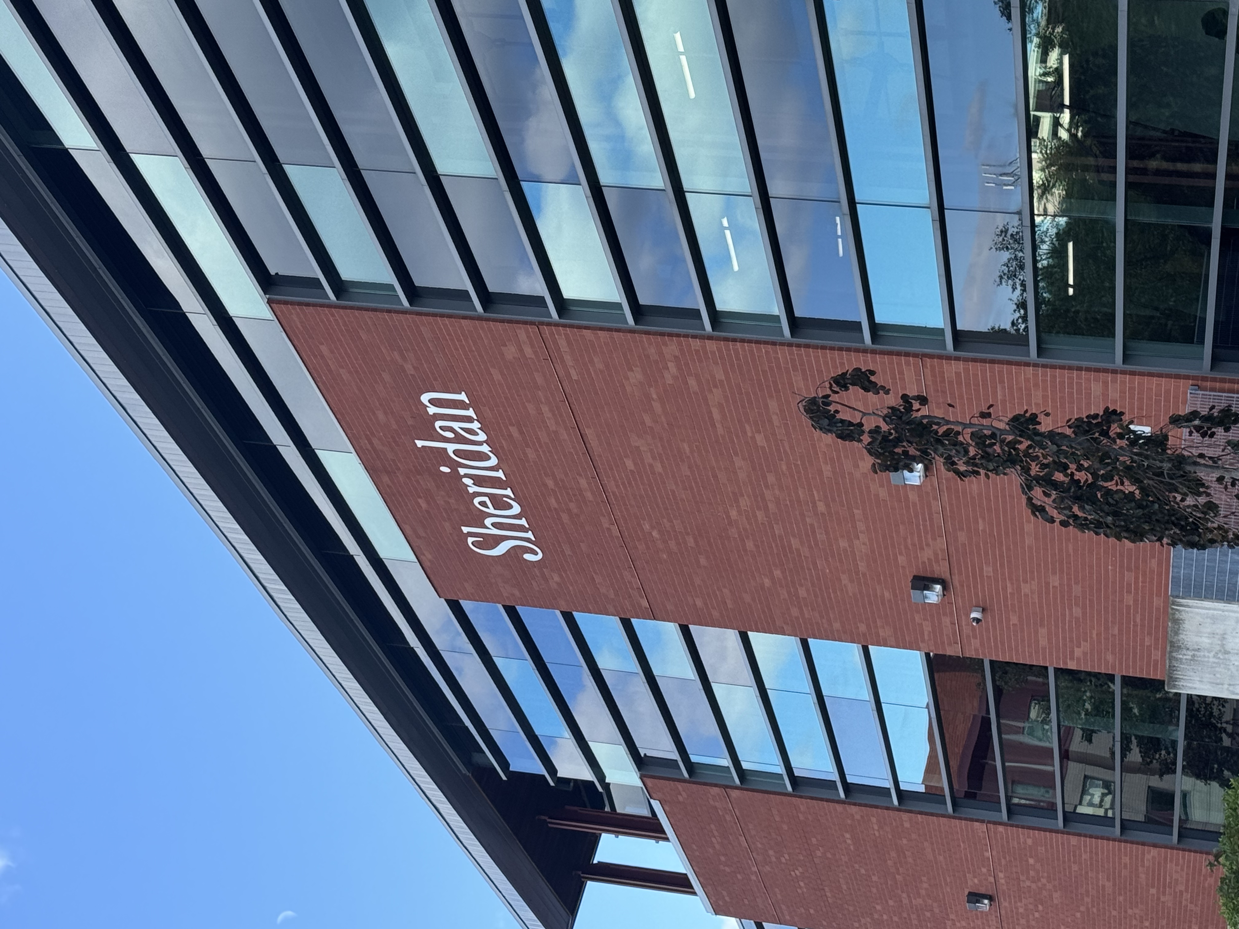
The colourful chairs create a welcoming and relaxing atmosphere, encouraging students to rest and socialize outdoors. Their arrangement around a central table supports group interaction. However, adding more shade or weather protection could make this area more comfortable throughout the year. The benches are positioned along the building wall, providing students with a convenient resting area without blocking the main walkway. However, the lack of shade and weather protection may make the seating less comfortable during hot or rainy weather. The directional sign is positioned near the building entrance, helping students locate classrooms and facilities as they enter. Its clear arrows, symbols, and colour-coded sections make navigation easier and reduce confusion, especially for students who are unfamiliar with the campus. The campus map is located near the building entrance, helping students understand the overall campus layout and locate different buildings. Its colour-coded labels make locations easier to identify. However, adding a clearer “You Are Here” marker could help new students orient themselves more quickly. This outdoor seating area provides a quiet space for students to relax. However, its relatively isolated location and exposure to cold weather may discourage students from using it. Fallen leaves have also accumulated around the chairs, suggesting that more frequent maintenance and better weather protection could improve the space. The long tables and closely arranged chairs encourage group activities and social interaction. However, the lack of partitions and limited personal space may make it difficult for students to study independently or have private conversations. Adding smaller seating areas could provide more flexibility for different activities. This hallway is relatively narrow and long, which may make students feel confined, especially during busy class transitions. However, the skylights provide natural light and make the space feel more open. Adding clearer directional signs could help students navigate the hallway more easily. The overhead directional sign in the B Wing provides clear information about classroom locations and directions. Its elevated position makes it visible from a distance, while the blue background and white text create a strong visual contrast. The arrows and room numbers help students navigate the building more efficiently and reduce confusion when finding classrooms. However, the sign may be less accessible to people who have difficulty looking upward or reading information from a distance. The library uses multiple rows of overhead lights to provide bright and consistent lighting throughout the study area. This design helps students read and work more comfortably, especially in areas with limited natural light. However, the strong artificial lighting may cause glare or visual fatigue for some students. Adjustable lighting in different study zones could help accommodate individual preferences and improve comfort. The library study area uses small partitions between students sitting face-to-face, providing a degree of visual privacy while maintaining an open environment. This arrangement helps reduce visual distractions and allows students to focus on individual tasks. However, the relatively low partitions may not fully prevent distractions from nearby conversations or movement. Taller partitions or more enclosed seating options could provide greater privacy for students who prefer a quieter study environment. The large study room features a high ceiling with triangular skylights and suspended lighting fixtures. The skylights allow natural light to enter the space, while the artificial lights provide additional illumination. The high ceiling also creates a sense of openness, making the study environment feel more spacious and less confined. However, the exposed structural beams and lighting fixtures may make the ceiling appear visually busy. The large study room entrance features tall glass windows and double doors, creating a visual connection between the indoor and outdoor spaces. The windows allow natural light to enter and make the entrance feel more open. However, the area near the doors appears relatively dark compared to the bright outdoor environment. Additional lighting could improve visibility and make the transition between spaces more comfortable. From the perspective of Environmental Psychology, this individual study booth provides a more private and comfortable space through its high surrounding panels and soft seating. The enclosed design helps reduce visual distractions and creates a sense of personal space, allowing students to concentrate or relax. However, the limited space inside the booth may feel restrictive to some users, and the partially enclosed structure may not completely block surrounding noise. From the perspective of Environmental Psychology, this quiet study room uses individual desks with high partitions on both sides and in front to create private study spaces. This arrangement reduces visual distractions and helps students maintain concentration while studying independently. However, the enclosed desk layout may limit social interaction and make the space feel somewhat restrictive for students who prefer a more open learning environment. From the perspective of Architectural Psychology and Environmental Psychology, this large study area combines open tables with separate enclosed study spaces to accommodate different learning needs. The open layout encourages communication and collaboration, while the enclosed areas offer greater privacy and fewer distractions. However, the large shared space may become noisy during busy periods, making it more difficult for students at the open tables to concentrate. From the perspective of Environmental Psychology and Architectural Psychology, this corridor uses large glass windows to introduce natural light into the building. The sunlight creates a bright and welcoming atmosphere, while the windows provide a visual connection to the outdoor environment. However, direct sunlight may cause glare at certain times of the day, potentially affecting visual comfort for students walking through the corridor. From the perspective of Environmental Psychology and Architectural Psychology, placing a piano in a shared campus space creates opportunities for creativity, relaxation, and social interaction. The large windows provide natural light, making the area feel more open and welcoming. However, the piano is located near a shared circulation area, so music may disturb students who prefer a quieter environment. This suggests the importance of balancing creative activities with the different needs of people using the space. From the perspective of Architectural Psychology, this overhead directional sign helps students navigate the campus by providing clear directions to classrooms and important facilities. The use of arrows, recognizable icons, and contrasting colours makes the information easier to identify. However, the amount of text on the sign may require students to stop and read carefully, particularly when navigating an unfamiliar area. A clearer visual hierarchy could help users identify their destinations more quickly. From the perspective of Architectural Psychology, this directional sign is positioned near a campus junction to help students navigate between different facilities, including the food court and student activity areas. The arrows, symbols, and colour-coded building labels support spatial orientation and reduce the need to search for directions. However, the sign contains several destinations in relatively small text, which may make it difficult for students to identify the correct direction from a distance. From the perspective of Landscape Theory and Environmental Psychology, this campus garden pathway combines natural elements, curved walking paths, and outdoor seating to create a relaxing environment. The trees and greenery provide visual interest and opportunities for students to take short breaks between classes. However, the limited sheltered areas may reduce the comfort and usability of this space during rainy or cold weather. This residence area combines wayfinding signage with natural elements such as grass, trees, and wildlife. The R2 sign helps students identify their location and navigate the campus more easily. From the perspective of Landscape Theory and Environmental Psychology, the presence of greenery and geese creates a connection between the built environment and nature. However, the geese may occasionally occupy areas near pedestrian routes, so maintaining a safe distance between people and wildlife is important. This pathway connects the student residence area with other parts of the campus. The surrounding grass and trees create a connection between the natural landscape and the built environment. From the perspective of Landscape Theory, the pathway provides a clear walking route, while the nearby lighting supports visibility. However, the path is relatively narrow, which may make it less comfortable when several students are walking in opposite directions. This flowering tree outside the student residence adds natural elements to the surrounding architectural environment. From the perspective of Landscape Theory, its curved branches and white blossoms create a visual contrast with the straight lines and geometric structure of the building. Environmental Psychology also suggests that exposure to natural elements may contribute to a more pleasant and relaxing atmosphere. This large S-shaped sculpture serves as a recognizable landmark on campus. From the perspective of Architectural Psychology, its distinctive shape and size make the surrounding space easier to identify and remember, supporting spatial orientation and wayfinding. Landscape Theory also highlights how the sculpture becomes a focal point within the outdoor environment, creating a visual connection between the surrounding buildings, pathways, and greenery. Its unique design also contributes to the visual identity of the campus. The exterior of this campus building combines red brick walls, large glass windows, and the Sheridan logo. From the perspective of Architectural Psychology, the contrast between solid brick surfaces and transparent glass creates a distinctive architectural appearance and strengthens the visual identity of the campus. The large windows also allow natural light to enter the building, which may contribute to a brighter and more comfortable indoor environment. The prominent Sheridan logo makes the building easier to recognize and supports spatial orientation.

Design Challenge 2
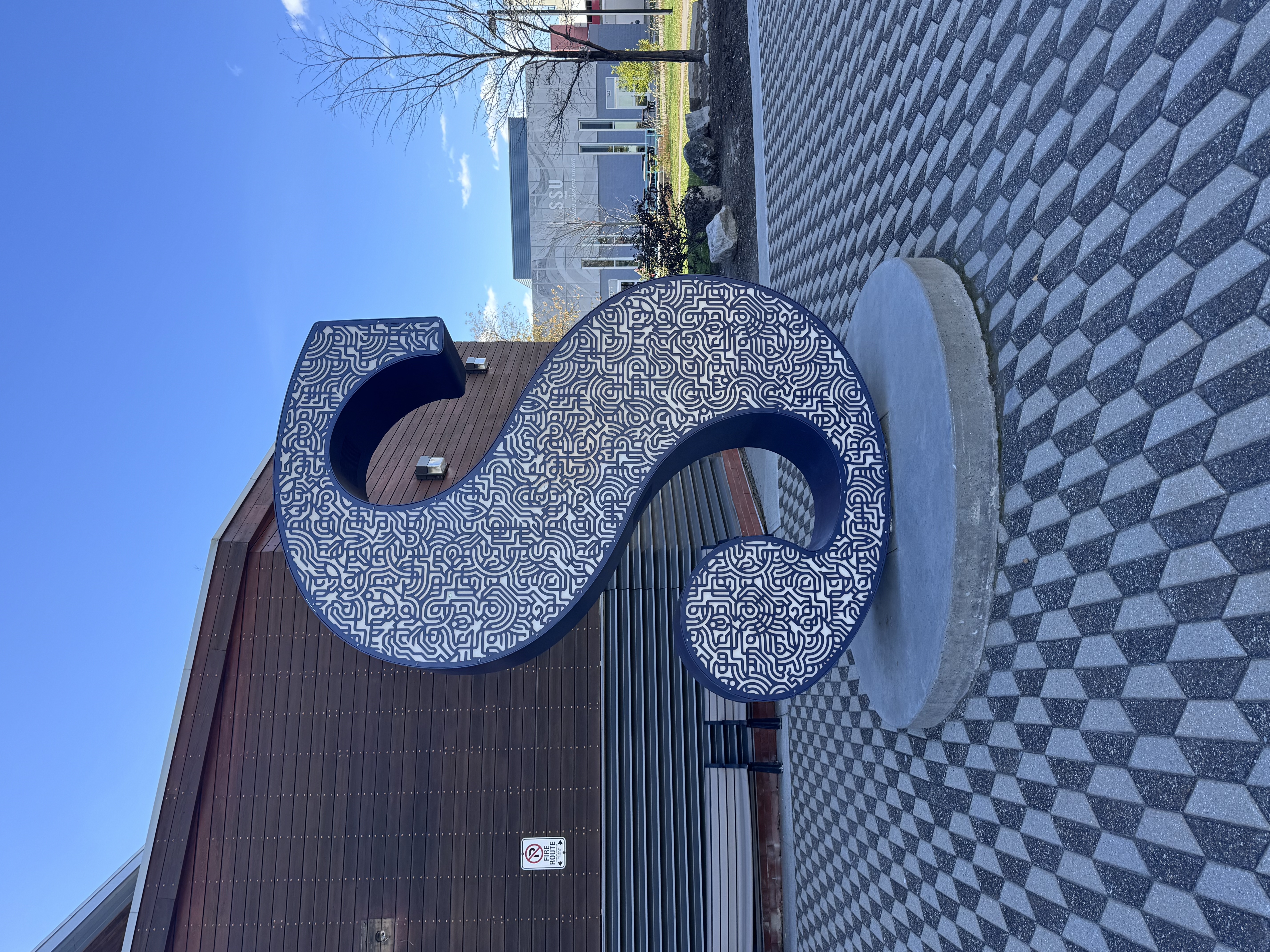
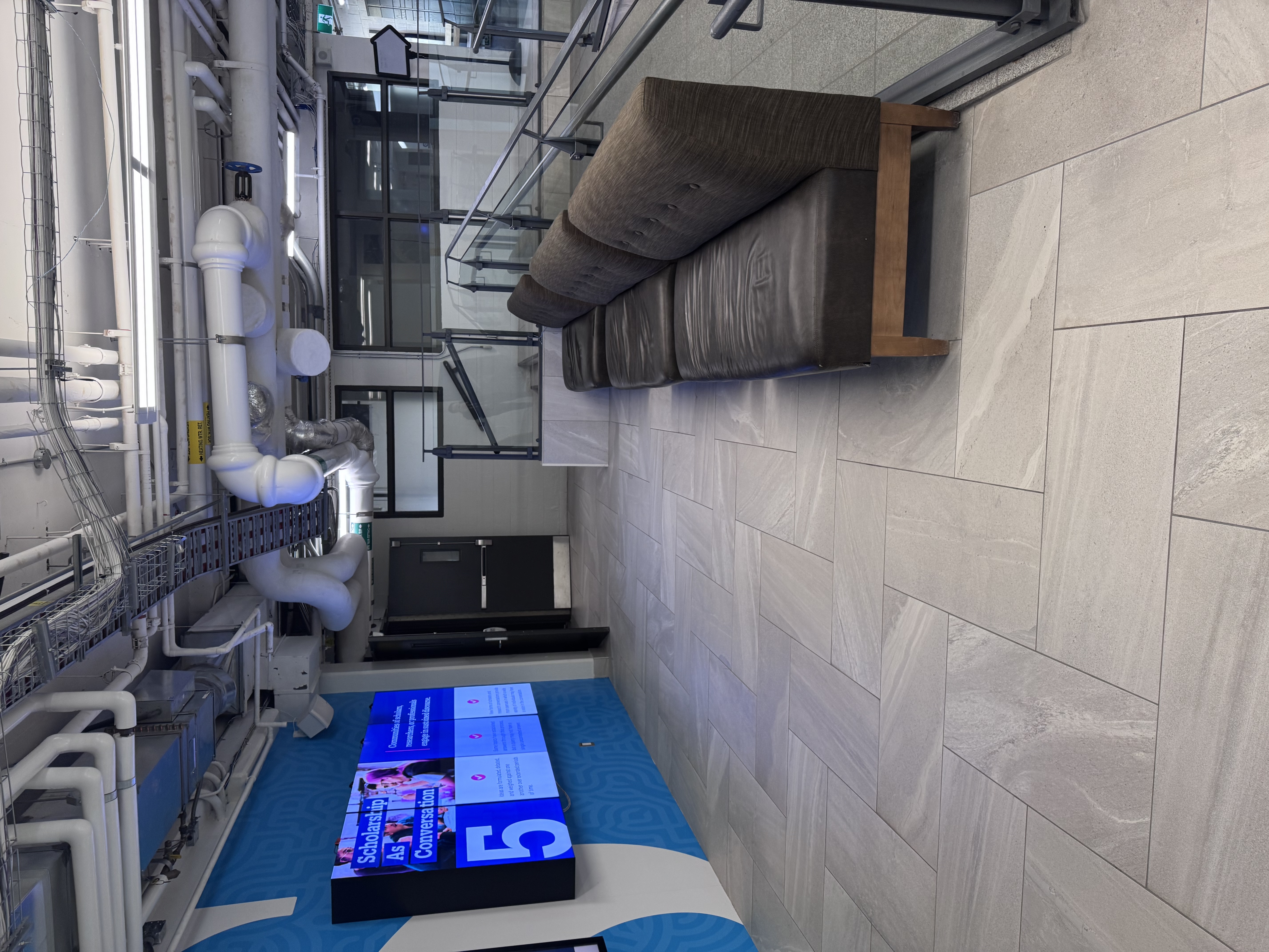
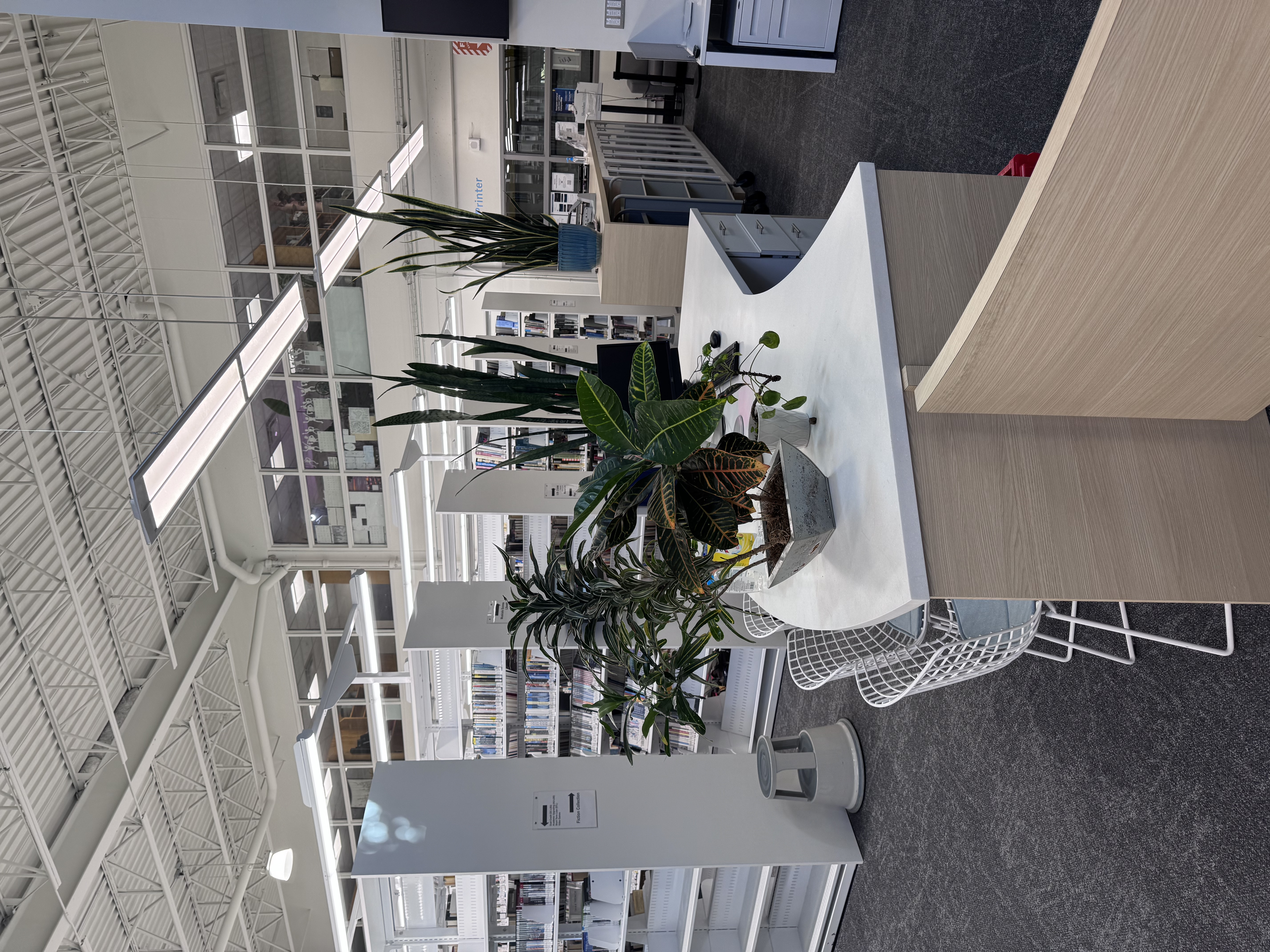
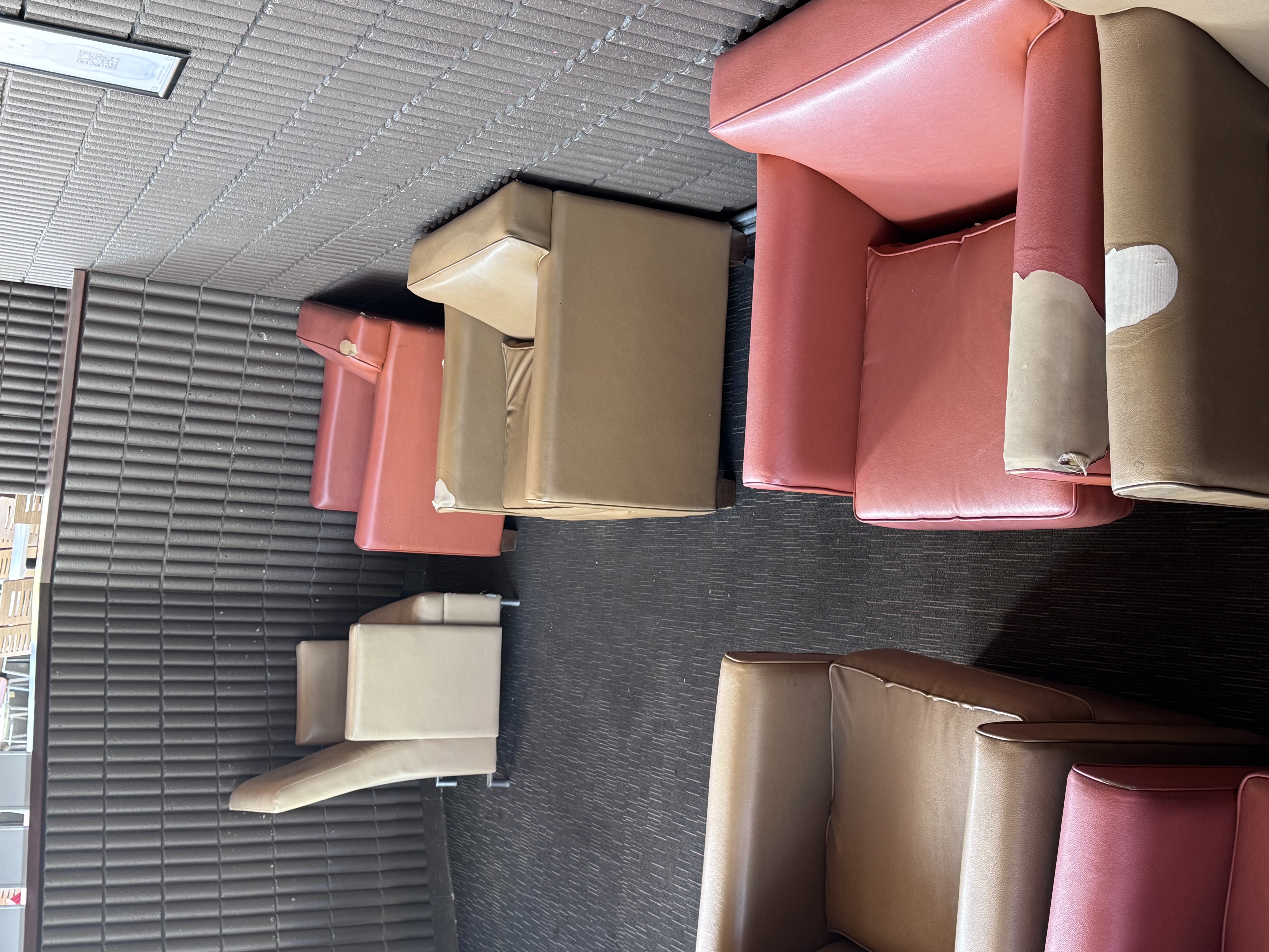
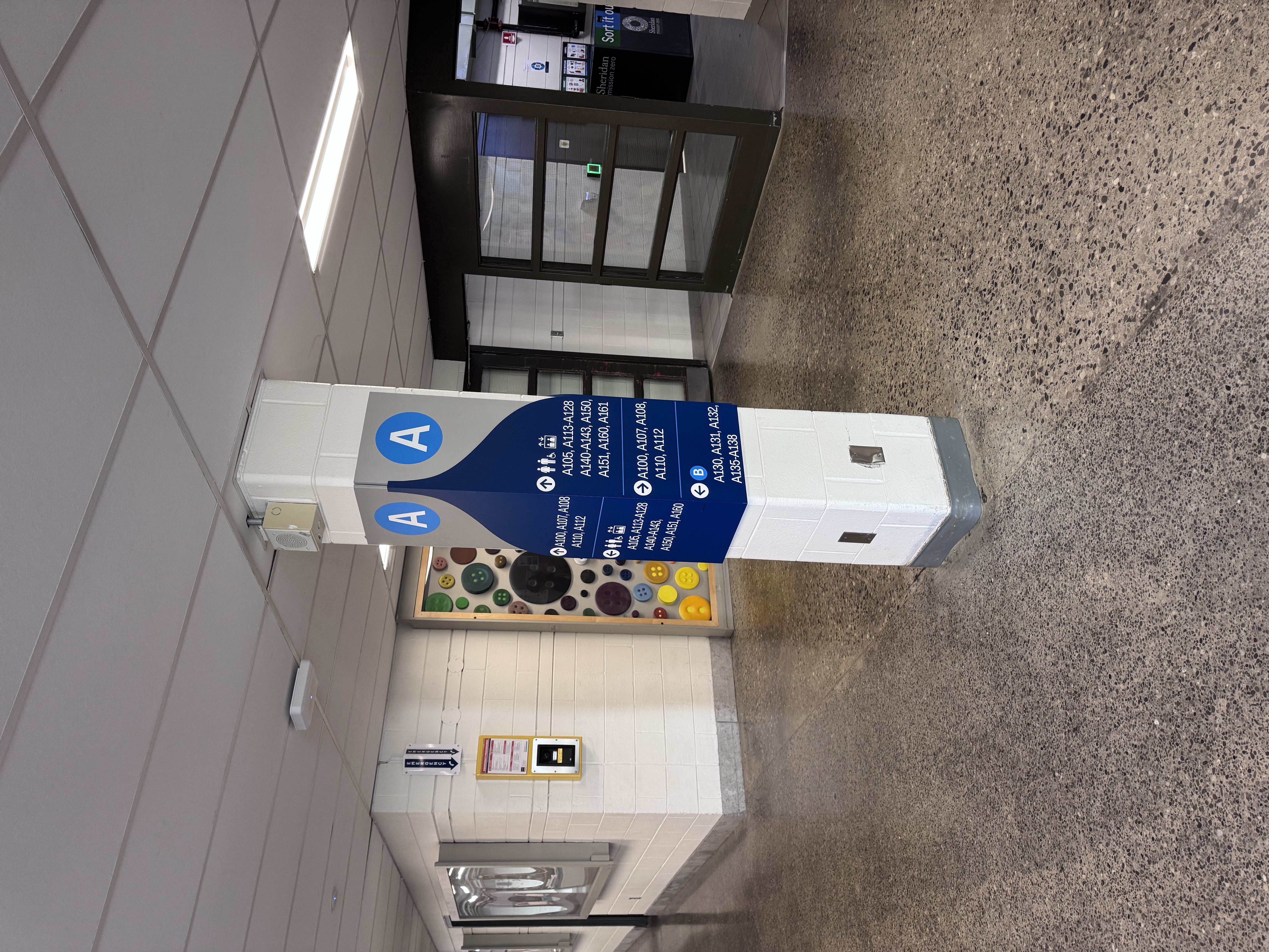
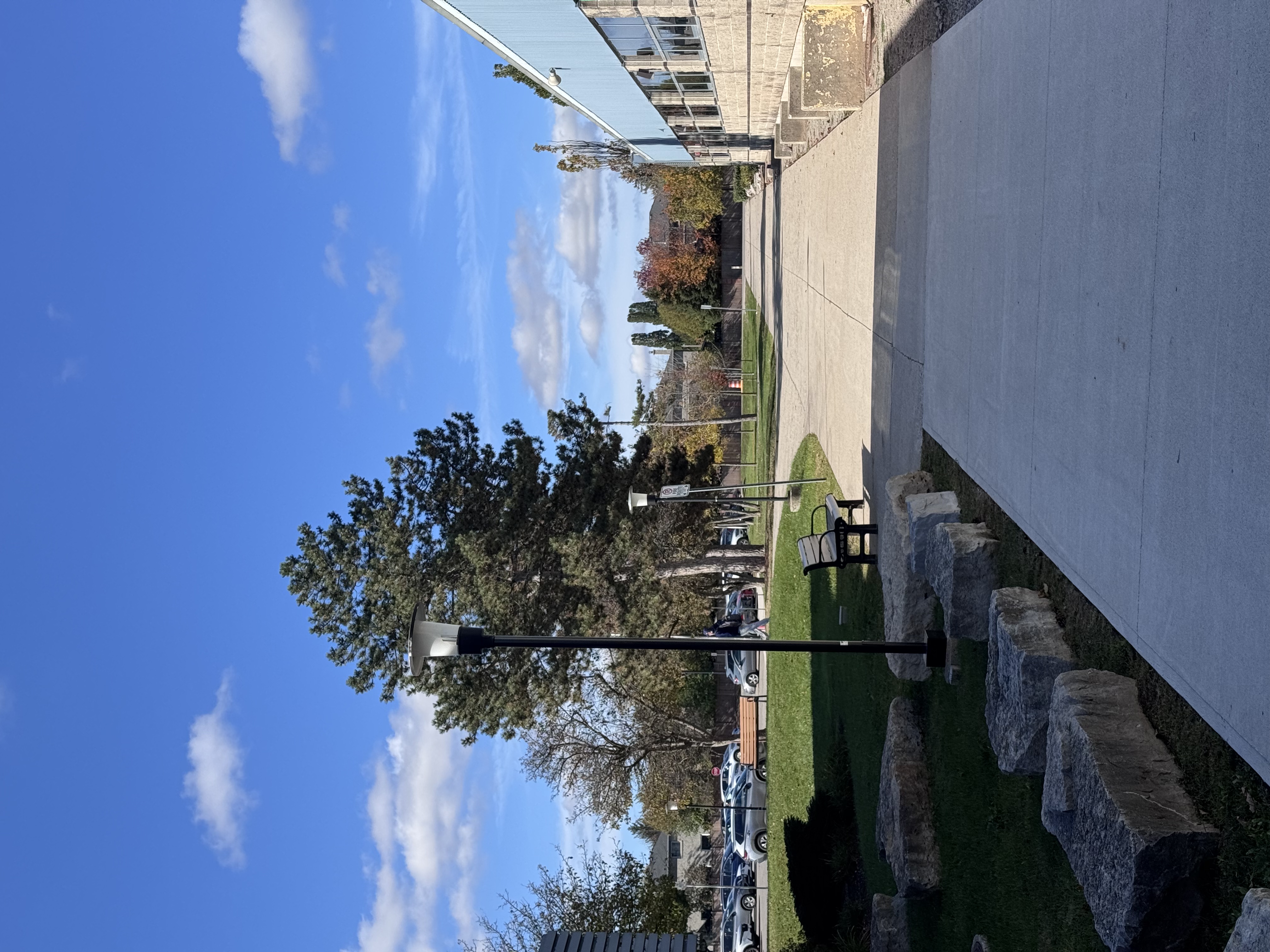
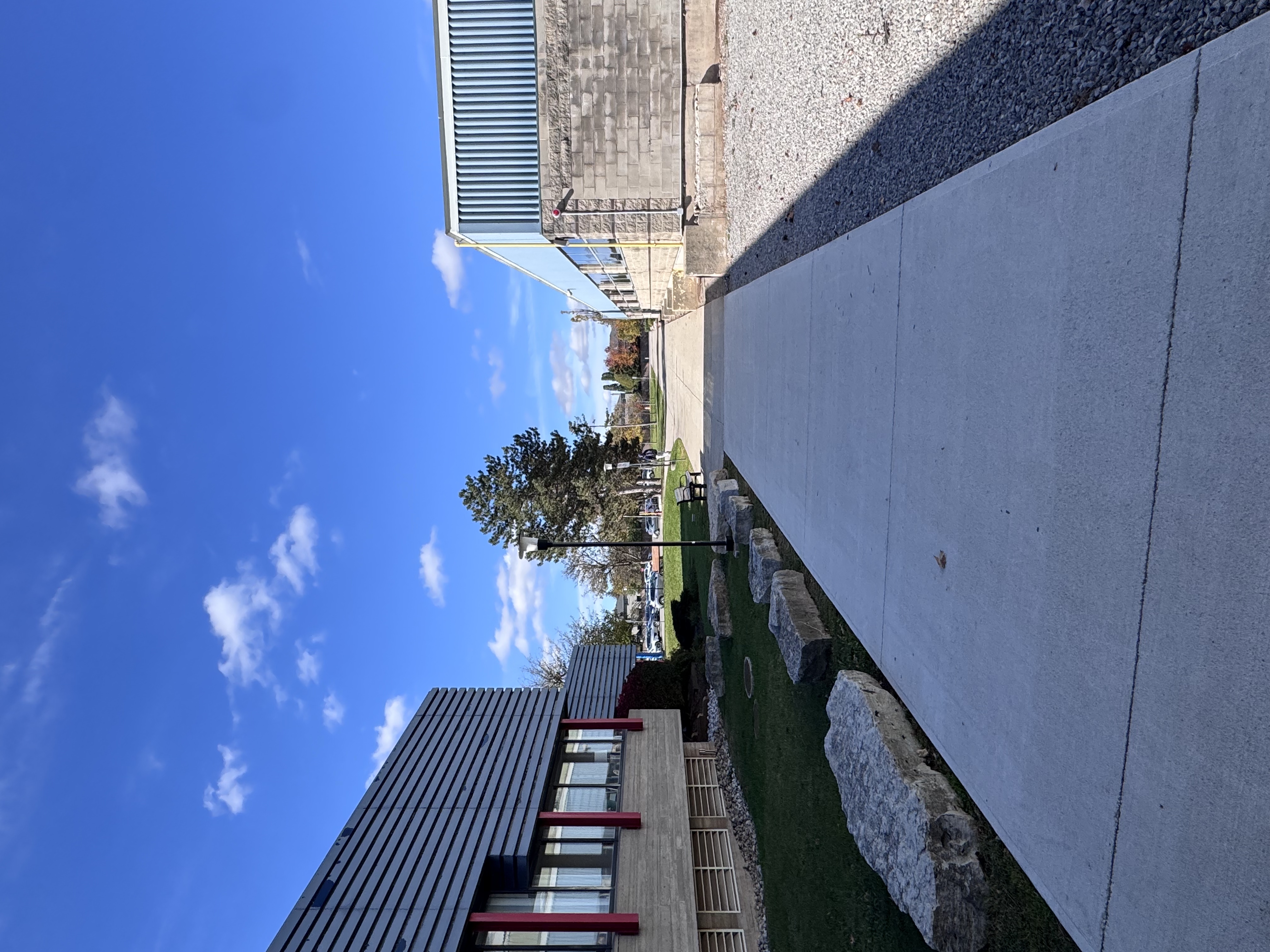
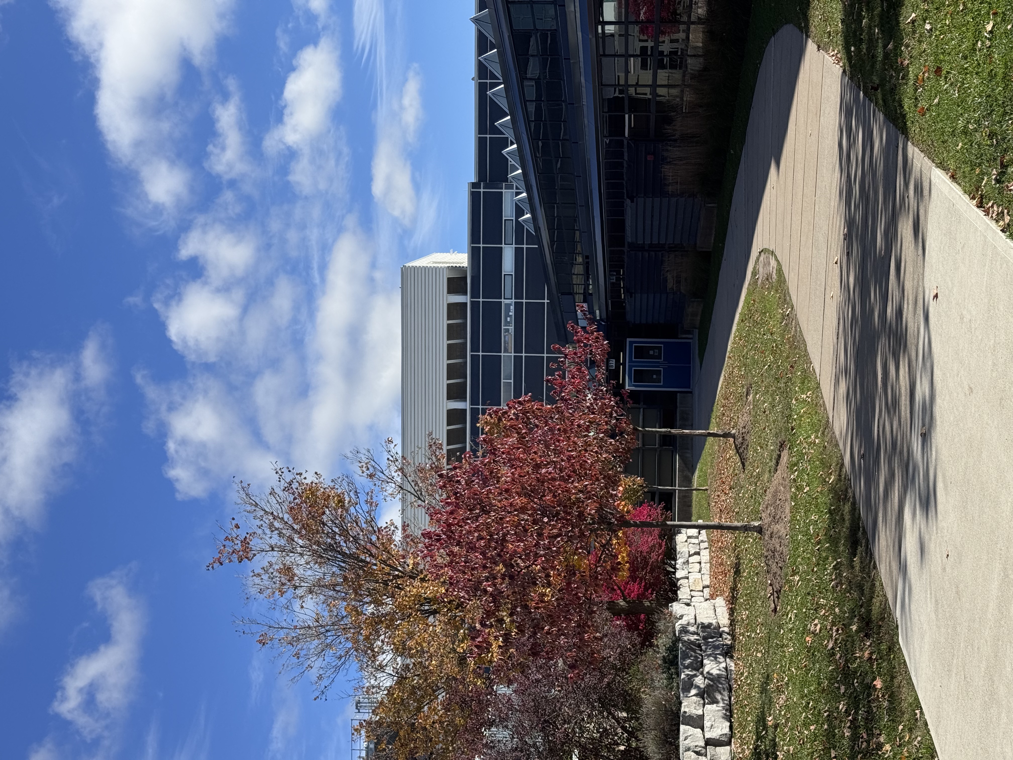
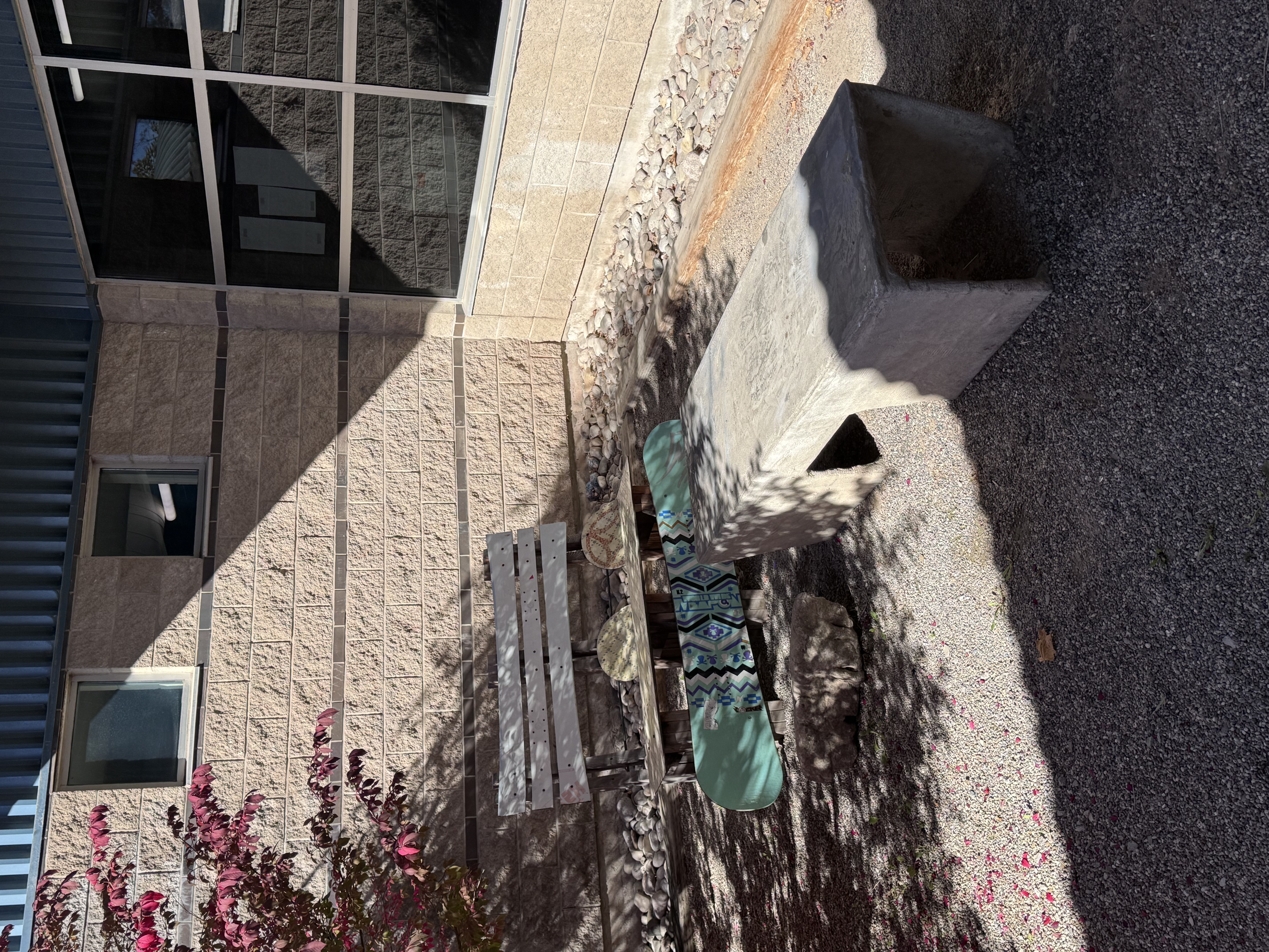
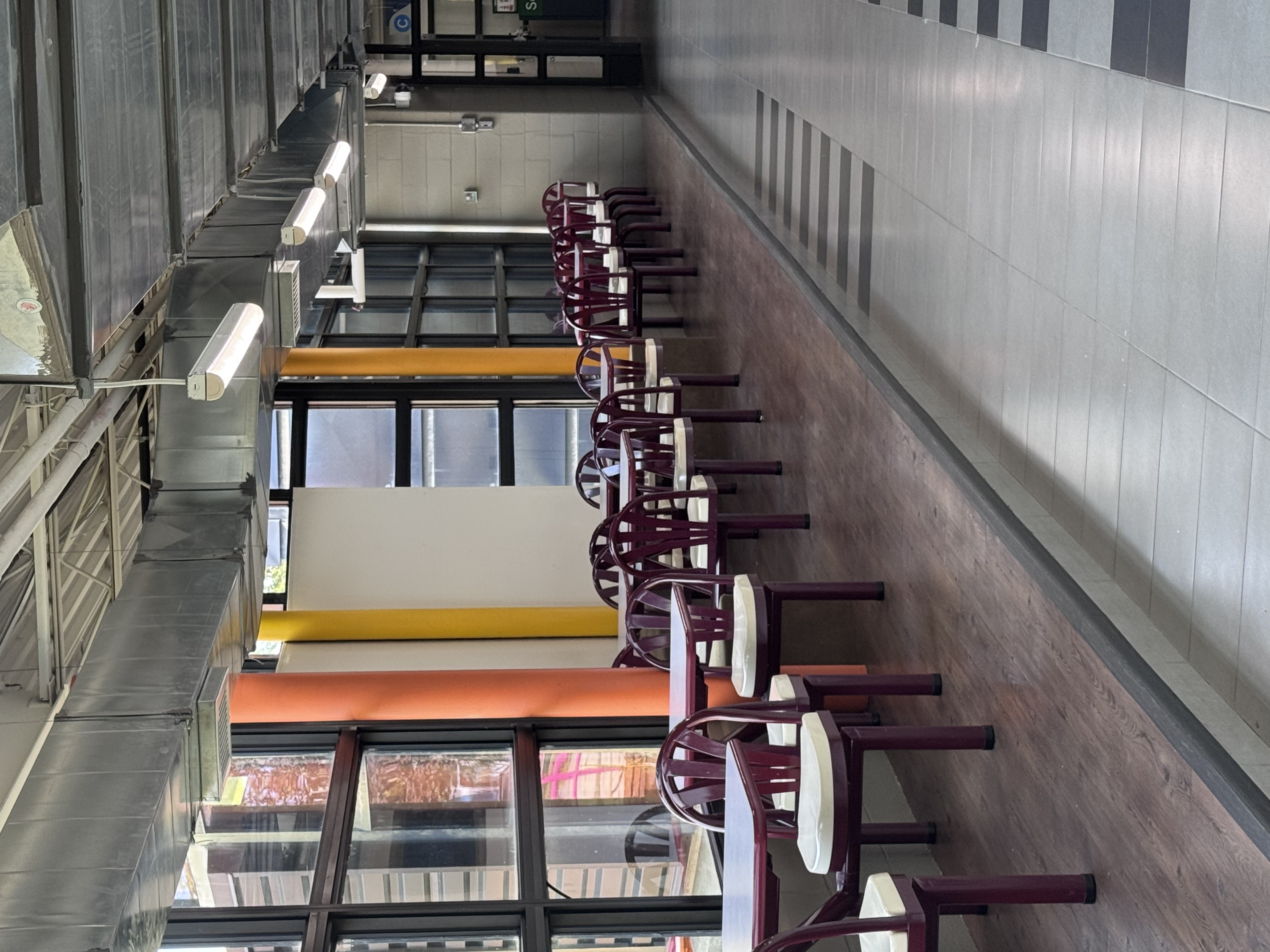
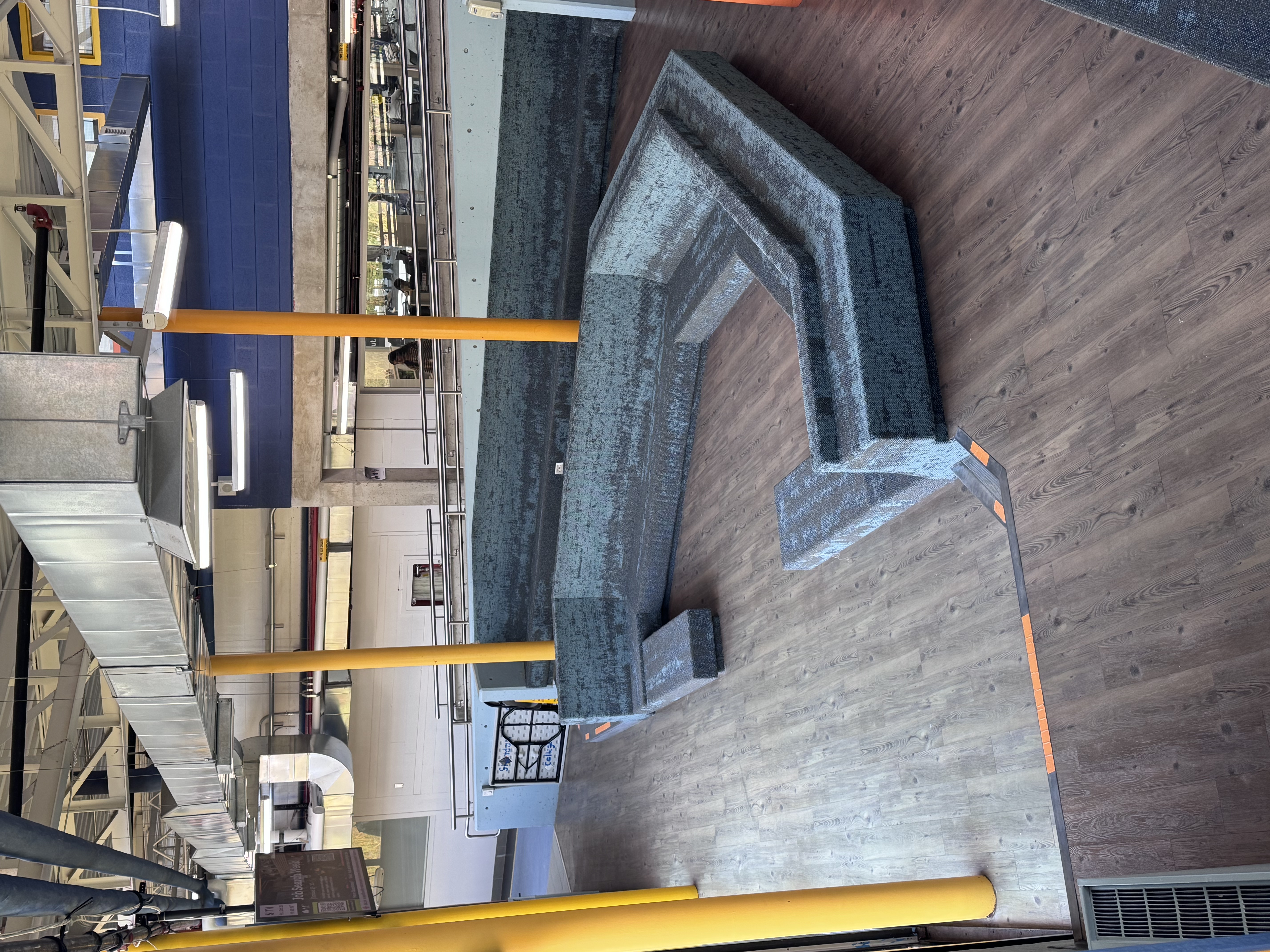
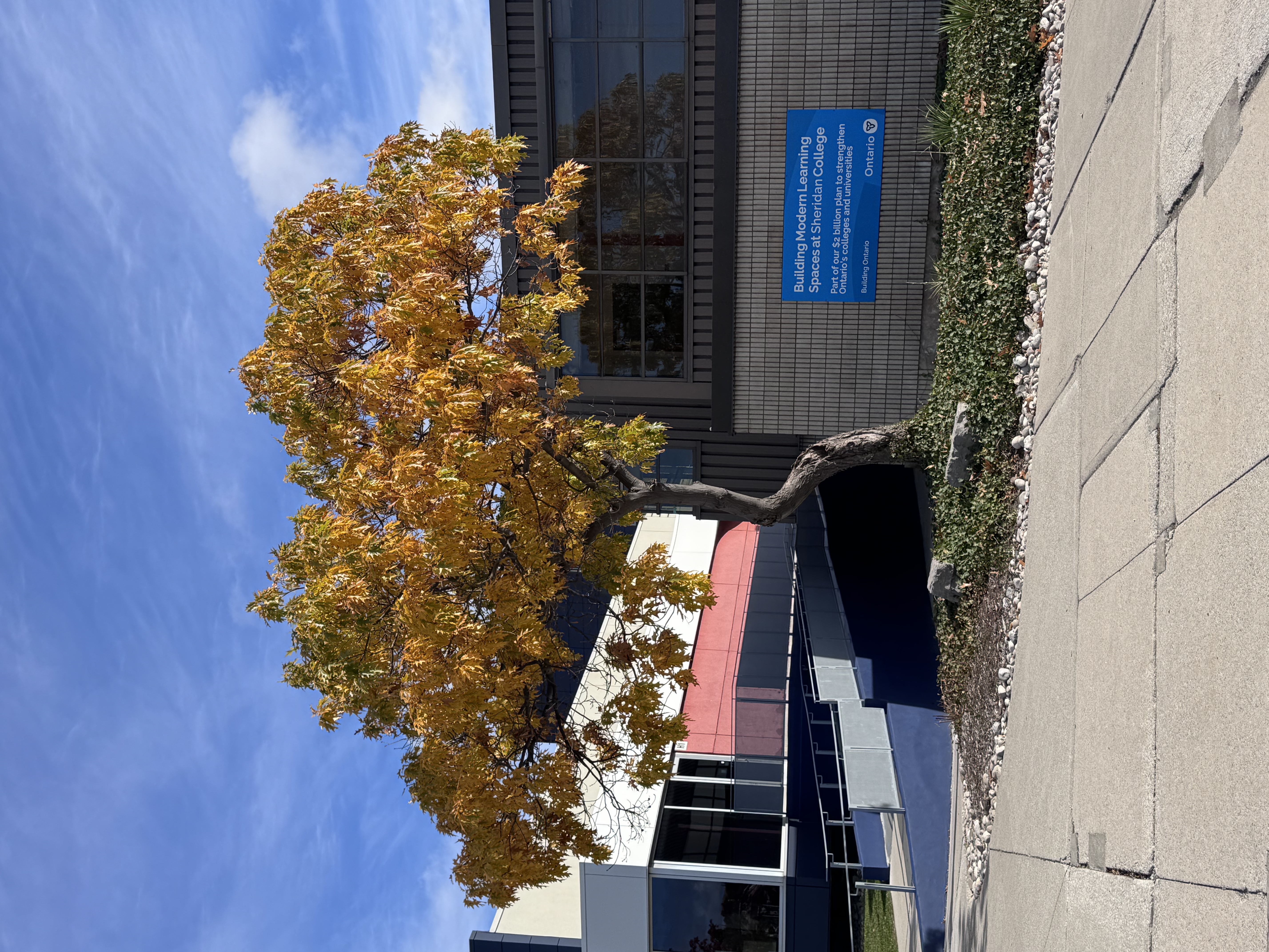
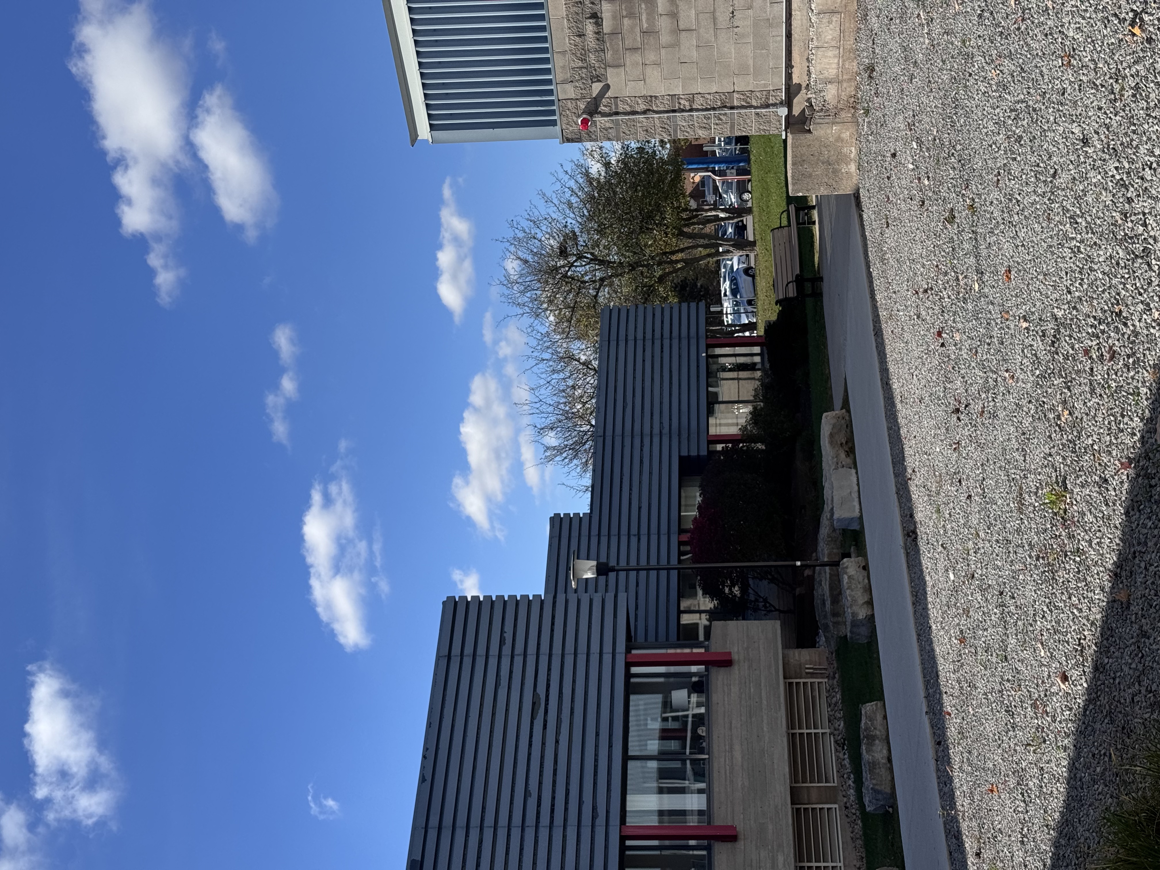
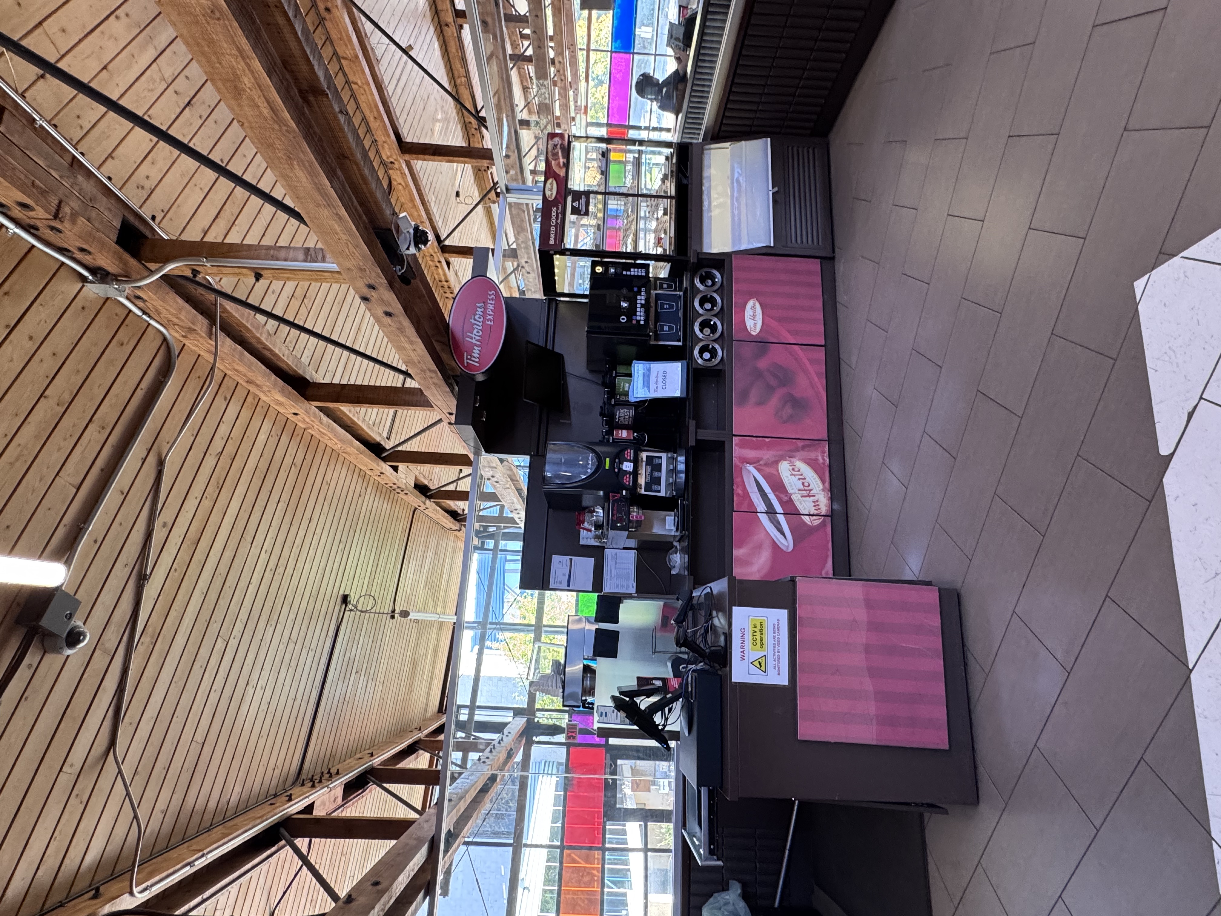
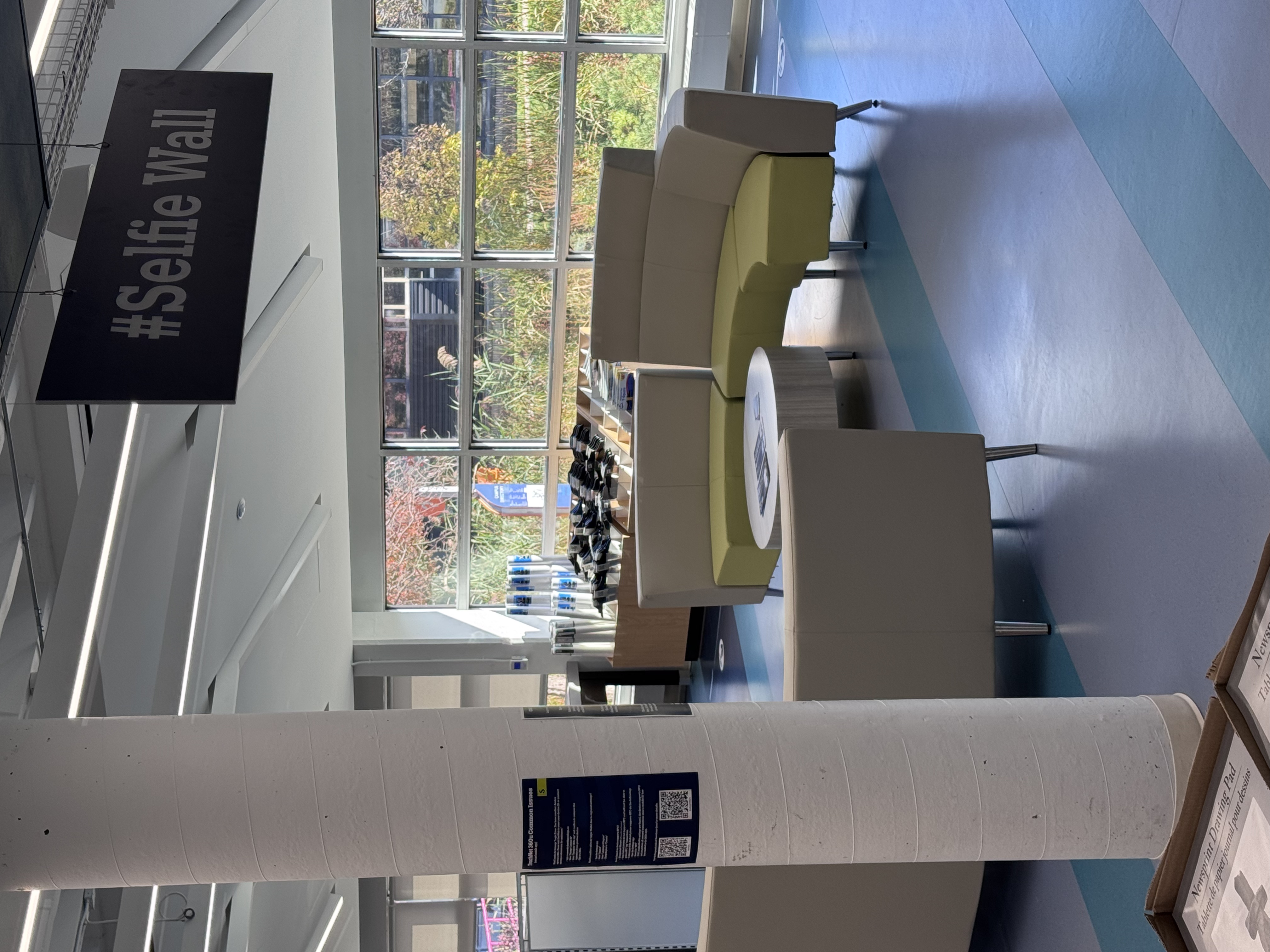
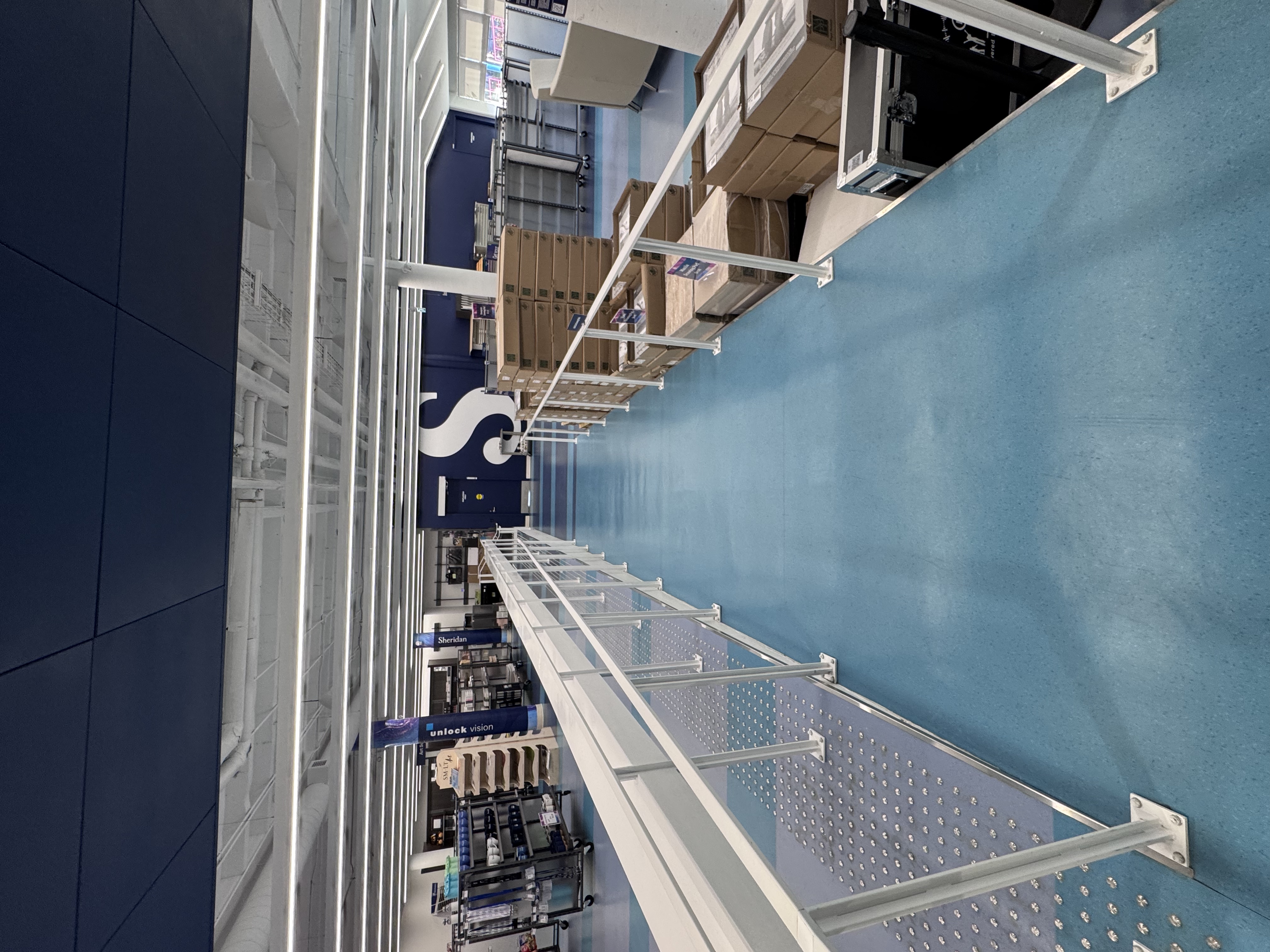
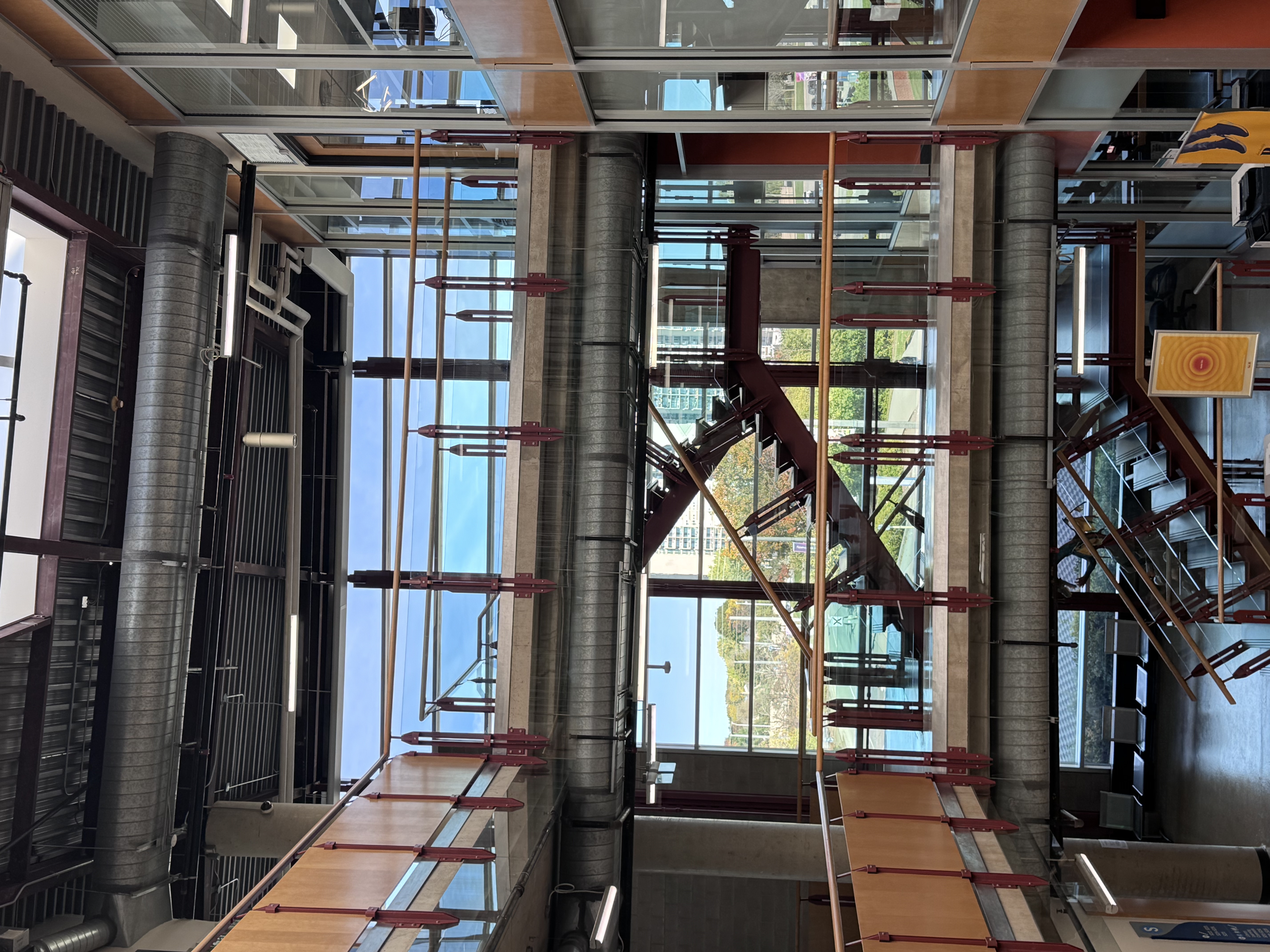
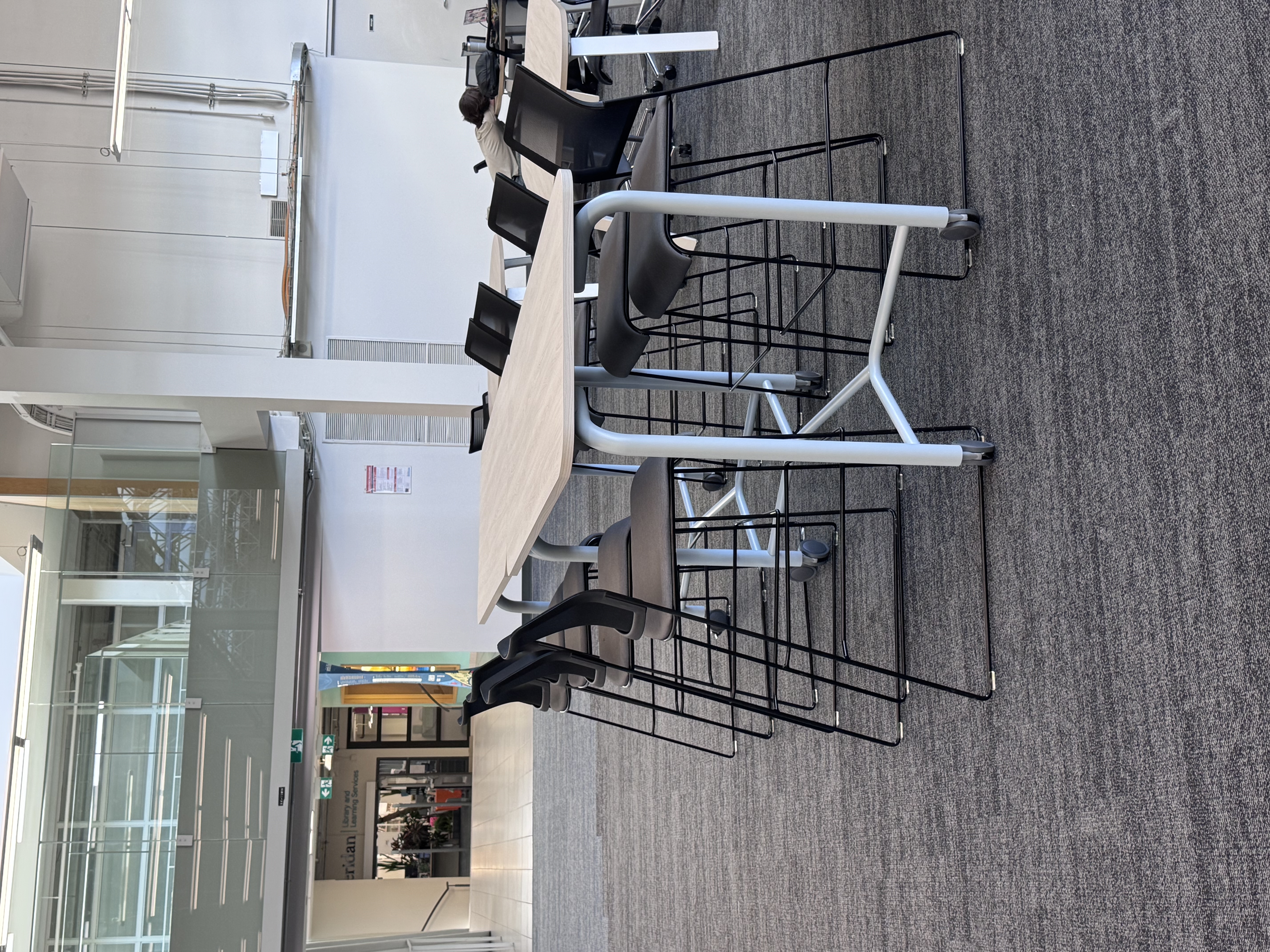
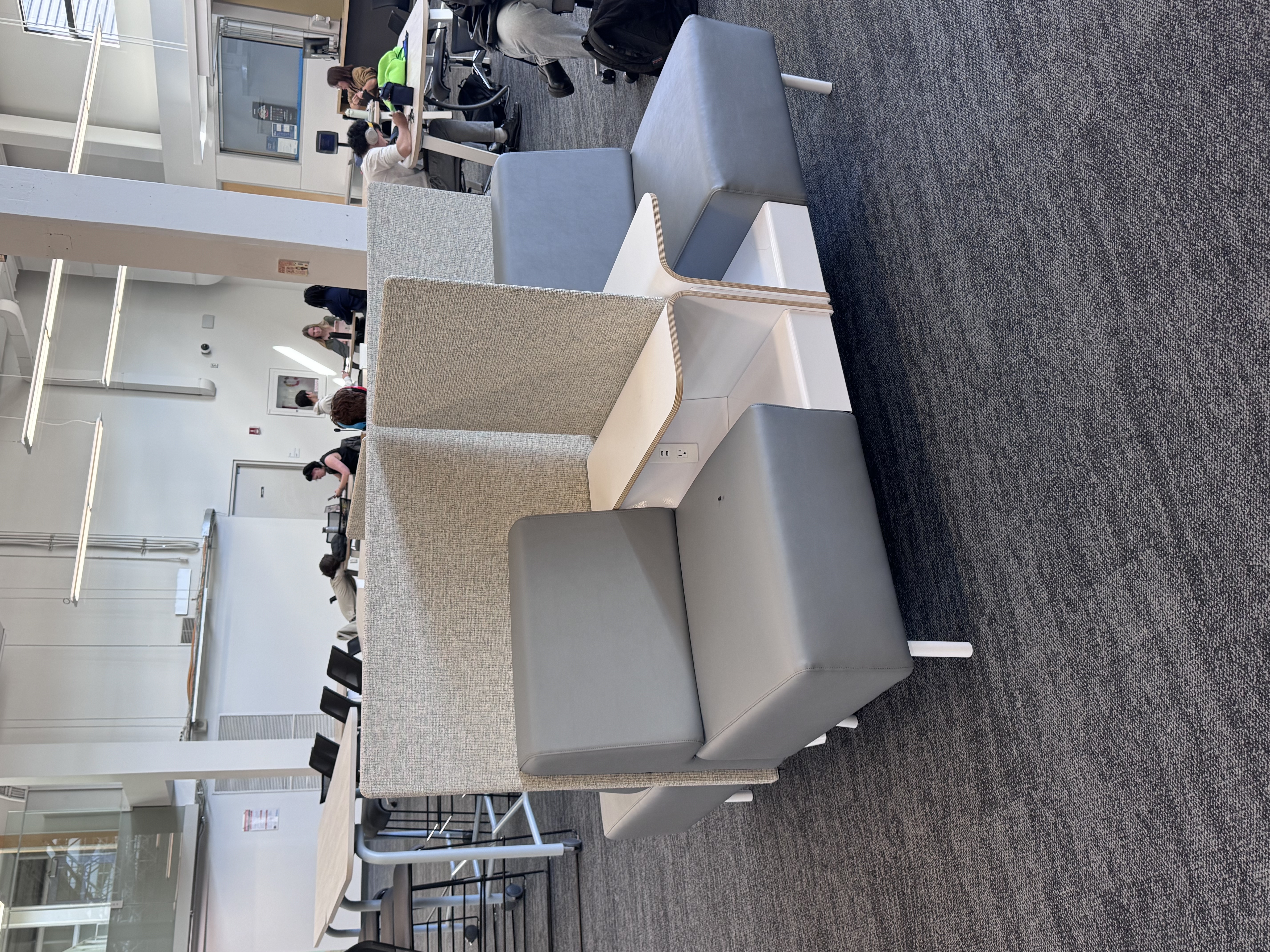
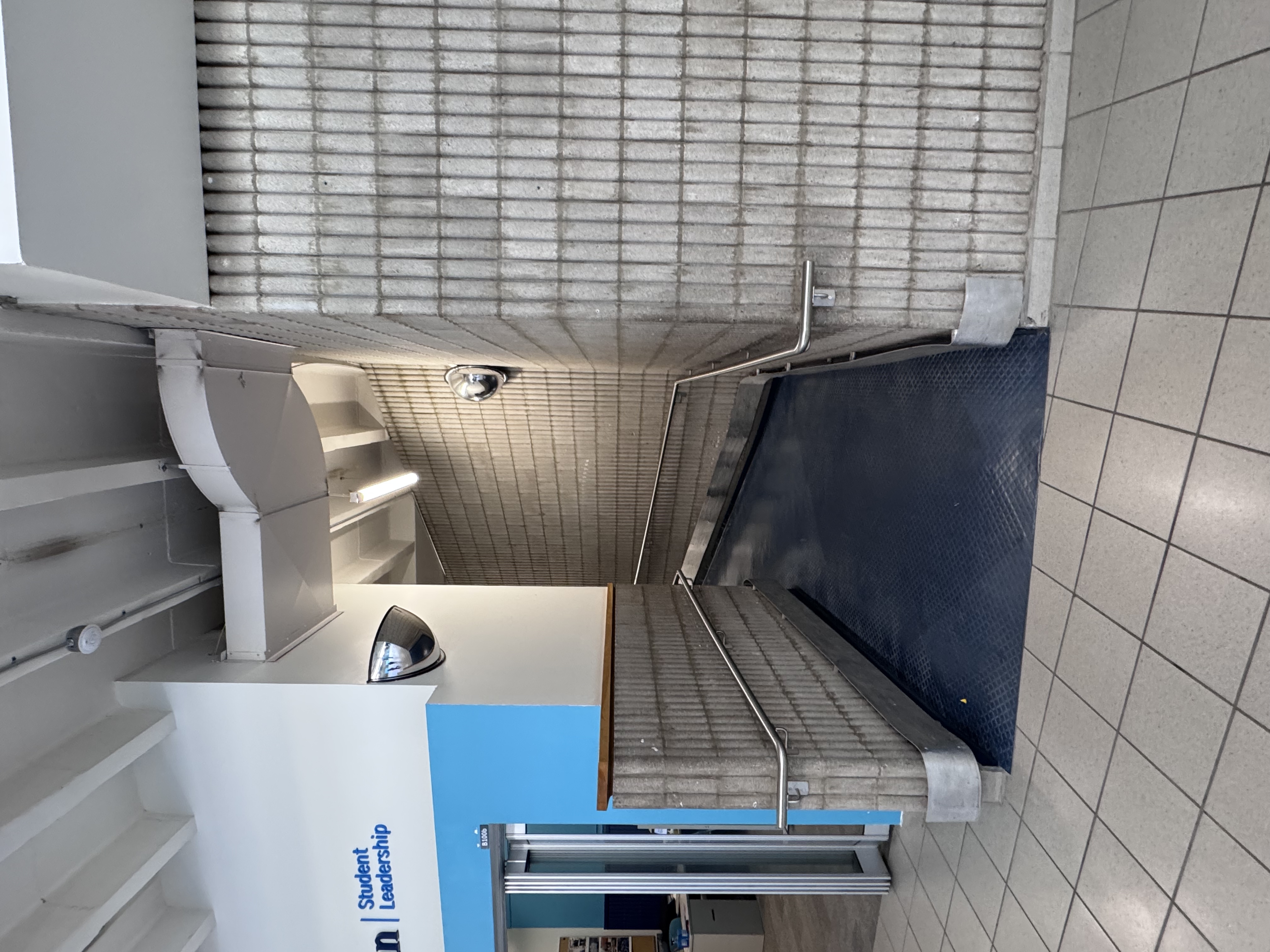
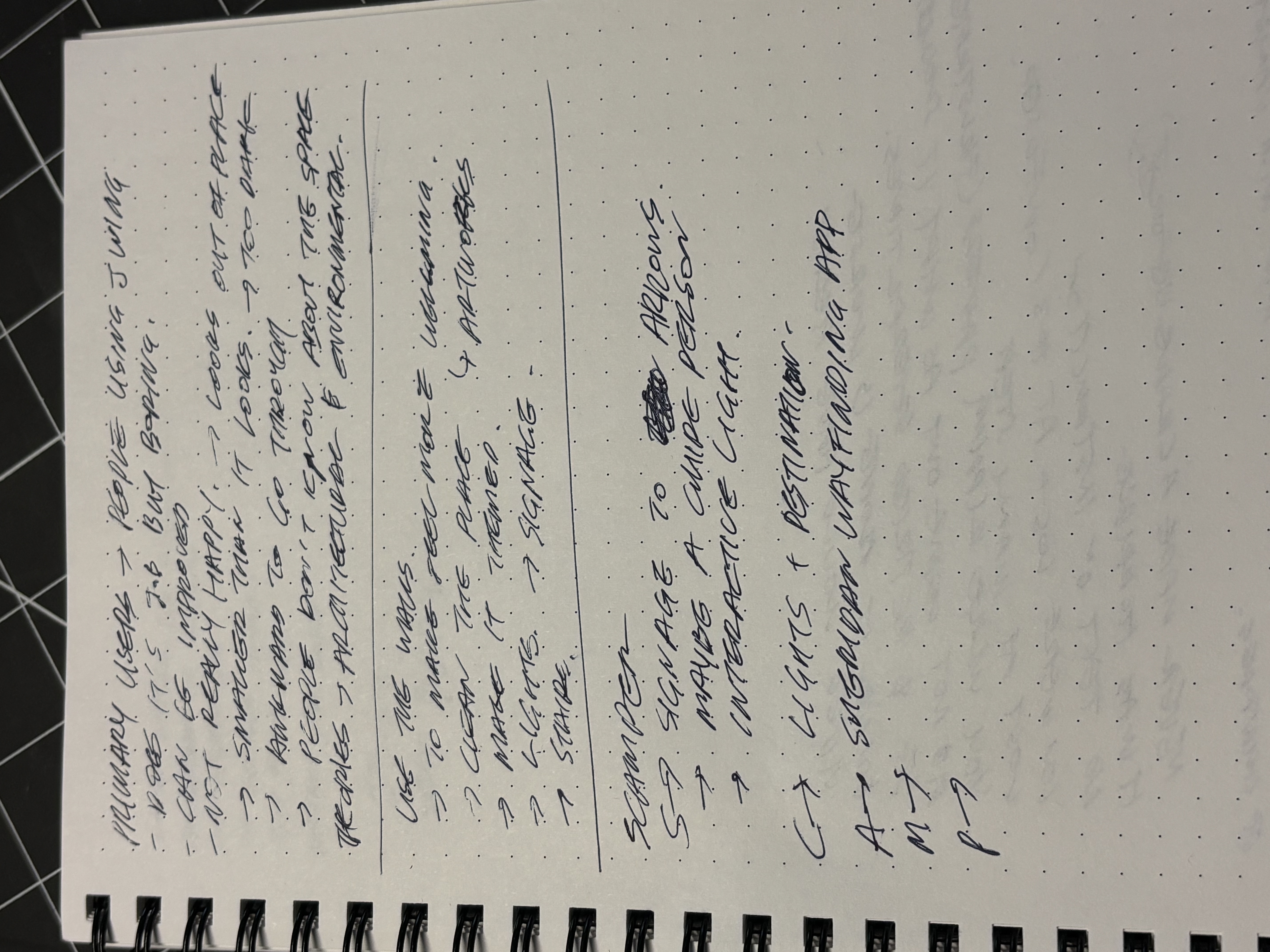
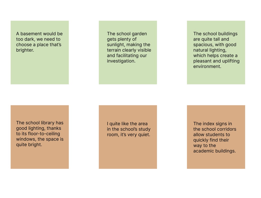
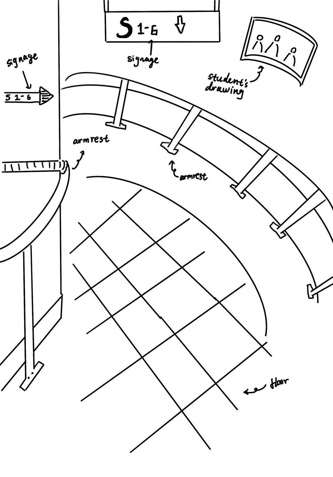
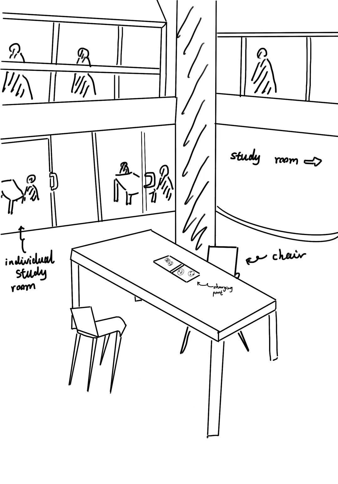
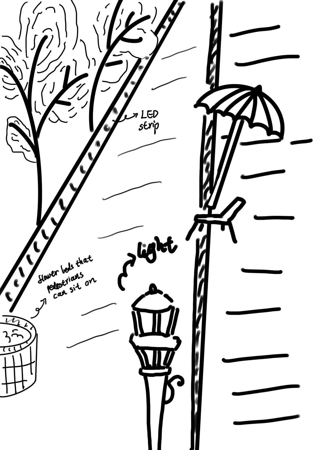
The large S-shaped sculpture serves as a recognizable campus landmark, helping students and visitors identify the location and navigate their surroundings (Architectural Psychology). Its distinctive shape, detailed patterns, and surrounding geometric pavement also create a strong visual focal point within the outdoor environment (Landscape Theory). However, the sculpture does not provide clear directional information. Adding small directional signs or AR navigation features could improve wayfinding while preserving its visual identity. The sofa outside the study room provides a convenient resting area where students can relax or wait between study sessions (Environmental Psychology). Its placement beside the glass railing maintains an open walkway and creates a sense of spatial openness (Architectural Psychology). However, the exposed ceiling pipes, bright overhead lighting, and lack of small tables may make the space feel less comfortable for extended breaks. Adding warm lighting, small side tables, and a few plants could create a more welcoming and relaxing environment. The open layout, bright lighting, and indoor plants create a welcoming and comfortable study environment. The use of biophilic design connects users with nature, while the organized bookshelves and consistent colours contribute to visual harmony and a sense of order. From an environmental psychology perspective, natural elements may help reduce stress and support concentration. However, the exposed ceiling and open seating arrangement may increase noise and distractions. Adding acoustic panels or small privacy dividers could improve comfort and provide a quieter study experience. The red and brown sofas create a warm and casual resting environment, while the textured walls add visual rhythm and a sense of enclosure. The arrangement reflects proximity and spatial organization from Gestalt theory, creating a semi-private seating area. From an environmental psychology perspective, the enclosed layout may provide a sense of privacy and comfort. However, the damaged upholstery reduces visual appeal and perceived cleanliness. Reupholstering the sofas, improving colour consistency, and adding small tables could make the space more comfortable and inviting. The blue directional signage creates a strong visual contrast against the neutral hallway, demonstrating visual hierarchy, contrast, and Gestalt's proximity principle by grouping room numbers and directional symbols. From an environmental psychology perspective, clear wayfinding can reduce confusion and help students navigate unfamiliar spaces. However, the small text and multiple directions may increase cognitive load, especially for first-time visitors. Enlarging the text, simplifying the information, and adding clearer directional arrows could improve readability and accessibility. The wide, straight pathway demonstrates leading lines, balance, and visual hierarchy, naturally guiding pedestrians through the campus. The surrounding trees, grass, and natural stones reflect biophilic design, which may reduce stress and create a relaxing atmosphere from an environmental psychology perspective. The open layout also provides a clear sense of direction. However, the limited shaded seating and lack of visible directional signage could reduce comfort and navigation efficiency. Adding more shaded resting areas and wayfinding signs could improve the overall experience. The wide pathway between the academic buildings creates a welcoming and organized campus environment. From an Architectural Psychology perspective, the open layout and clear walking direction may enhance comfort and spatial orientation. Environmental Psychology suggests that natural light and open spaces can contribute to relaxation and a positive emotional experience. From a Landscape Theory perspective, the combination of greenery, natural stones, and surrounding architecture creates a harmonious connection between the built and natural environments. The curved pathway, colourful autumn trees, and surrounding academic buildings create a visually appealing campus environment. From an Architectural Psychology perspective, the curved walkway provides a natural sense of direction and connects different campus spaces. Environmental Psychology suggests that greenery, natural light, and seasonal colours may promote relaxation and positive emotions. From a Landscape Theory perspective, the combination of natural stone walls, trees, and modern architecture creates a harmonious balance between nature and the built environment, making the campus feel welcoming and peaceful. The combination of skateboards, wooden seating, and a concrete bench demonstrates creative material reuse and an informal campus atmosphere. From an Architectural Psychology perspective, the small corner space provides a sense of enclosure and privacy. Environmental Psychology suggests that the surrounding greenery and natural light may create a relaxing environment. From a Landscape Theory perspective, the integration of natural stones and recycled materials adds visual interest. However, the uneven seating surfaces, limited back support, and gravel ground may reduce comfort and accessibility. Adding stable seating, smoother ground surfaces, and weather-resistant materials could improve the overall experience. The long row of tables and chairs creates an organized and functional space for studying and social interaction. From an Architectural Psychology perspective, the repeated seating arrangement provides a clear sense of order and separates the resting area from the main walkway. Environmental Psychology suggests that natural light from the large windows and warm interior colours may create a welcoming atmosphere. However, from a Landscape Theory perspective, the space lacks natural elements, making it feel somewhat monotonous. Adding indoor plants and improving the seating arrangement could enhance visual interest, comfort, and accessibility, especially near the raised platform. The connected, curved seating creates a comfortable space for short breaks and casual conversations. From an Architectural Psychology perspective, the semi-enclosed arrangement encourages social interaction while providing a sense of personal space. Environmental Psychology suggests that natural light from the nearby glass wall may improve mood and create a more welcoming atmosphere. From a Landscape Theory perspective, the curved seating and open floor area create a smooth spatial flow. However, the low seats and limited back support may reduce comfort, especially during longer breaks. Adding cushions and more supportive seating options could improve accessibility and the overall experience. The golden autumn tree creates a beautiful focal point and adds warmth to the surrounding modern architecture. From an Architectural Psychology perspective, the contrast between the organic tree shape and geometric building structures creates visual interest. Environmental Psychology suggests that natural scenery and seasonal colours may promote relaxation and positive emotions. From a Landscape Theory perspective, the combination of trees, groundcover plants, and decorative stones creates a harmonious connection between nature and the built environment. However, adding a nearby bench could make the space more inviting and encourage students to enjoy the scenery. The combination of modern academic buildings, a clear pedestrian pathway, and a nearby bench creates an organized and welcoming campus environment. From an Architectural Psychology perspective, the open layout and visible resting area support spatial orientation and comfort. Environmental Psychology suggests that natural light, greenery, and open skies may promote relaxation and reduce stress. From a Landscape Theory perspective, the arrangement of natural stones, grass, and architectural structures creates a balanced transition between built and natural spaces. However, adding more greenery to the large gravel area could make the landscape more visually appealing and inviting. The wooden ceiling, exposed beams, and colourful window panels create a warm and lively cafeteria environment. From an Architectural Psychology perspective, the open counter layout and spacious floor area support easy movement and access to the service area. Environmental Psychology suggests that natural light and warm wooden materials may create a welcoming and comfortable atmosphere. From a Landscape Theory perspective, the combination of natural materials and large windows helps connect the indoor space with its outdoor surroundings. However, clearer queue markings and more visible ordering instructions could improve navigation and reduce confusion during busy periods. The curved sofas and central table create a welcoming space for group discussions and social interaction. From an Architectural Psychology perspective, the semi-circular seating arrangement encourages face-to-face communication and collaboration. Environmental Psychology suggests that natural light from the large windows and the soft green seating may promote relaxation and comfort. From a Landscape Theory perspective, the curved furniture arrangement creates a smooth spatial flow, while the outdoor greenery strengthens the connection between indoor and natural environments. However, adding more movable seating could make the space more flexible for different group sizes. The wide ramp, blue flooring, and white handrails create a clear and organized pathway through the bookstore area. From an Architectural Psychology perspective, the open layout and handrails support spatial orientation and accessibility. Environmental Psychology suggests that the bright lighting and consistent blue colour scheme may create a comfortable and easy-to-navigate environment. From a Landscape Theory perspective, the ramp connects different floor levels and supports smooth pedestrian circulation. However, the stacked boxes near the ramp may create visual clutter and make the surrounding area feel crowded. Keeping storage materials away from circulation routes could improve safety and the overall experience. The multi-level staircase, glass railings, and exposed structural elements create a modern and visually dynamic interior. From an Architectural Psychology perspective, the open atrium and visible staircases help students understand the connections between different floors and navigate the building. Environmental Psychology suggests that natural light from the large windows and views of outdoor greenery may create a more welcoming atmosphere. From a Landscape Theory perspective, the layered walkways and staircases establish a sense of spatial depth and movement. However, the exposed pipes and complex structural details may create visual clutter. Simplifying the visual environment and adding clearer directional signage could improve navigation and comfort. The newly added high tables and chairs create a modern and flexible space for individual studying and group discussions. From an Architectural Psychology perspective, the open layout and movable tables support different learning activities and encourage collaboration. Environmental Psychology suggests that the neutral colours, bright lighting, and spacious surroundings may promote concentration and comfort. From a Landscape Theory perspective, the furniture arrangement creates a clear spatial organization while maintaining open circulation areas. However, the high seating may be less accessible for some students. Adding adjustable-height tables and standard-height chairs could improve inclusivity and comfort. The semi-enclosed seating booths provide students with a comfortable space for independent study. From an Architectural Psychology perspective, the high partitions create a sense of privacy and personal space while maintaining an open connection to the surrounding study area. Environmental Psychology suggests that the neutral colours and upholstered surfaces may support concentration and reduce visual distractions. From a Landscape Theory perspective, the modular seating arrangement creates clearly defined study zones within the larger shared space. However, the low seating and small work surfaces may be uncomfortable for extended study sessions. Adding adjustable tables and improved ergonomic support could enhance comfort and accessibility. The gently sloping ramp, continuous handrails, and textured flooring create a functional pathway connecting different areas of the building. From an Architectural Psychology perspective, the enclosed layout provides a clear route, while the handrails offer physical guidance and support. Environmental Psychology suggests that the narrow space, concrete walls, and limited natural light may make the corridor feel less welcoming. From a Landscape Theory perspective, the curved pathway creates a gradual transition between different floor levels. However, brighter lighting, clearer directional signage, and more inviting wall colours could improve accessibility, comfort, and the overall experience. During our in-class discussion, we reviewed potential campus locations and identified areas that could be improved through design. We considered Architectural Psychology, Environmental Psychology, and Landscape Theory, focusing on how spaces affect users' comfort and experience. Our notes highlighted issues such as unclear signage, limited lighting, and uninviting environments. We also brainstormed possible improvements, including interactive lighting, clearer wayfinding, and more welcoming public spaces. This activity helped us evaluate our initial ideas and identify opportunities for redesign. During our in-class activity, we used sticky notes to organize and evaluate different campus design issues. We grouped our observations into aesthetics, purpose, and location, identifying problems such as poor maintenance, unclear wayfinding, and spaces that feel uninviting. We also used coloured marks to compare ideas and discuss potential improvements. This process helped us narrow down our focus and identify areas that could benefit from redesign. This concept explores improvements to an existing campus corridor through clearer directional signage, additional handrails, student artwork, and floor patterns. These elements aim to improve navigation, accessibility, and the overall visual experience of the space. This concept explores a flexible library study space that supports both individual learning and group collaboration. Enclosed study rooms provide privacy and reduce distractions, while shared tables encourage communication and teamwork. Integrated charging ports improve convenience, and directional signage helps students locate study areas more easily. This concept explores improvements to the campus garden by introducing LED pathway lighting, additional streetlights, seating around flower beds, and shaded resting areas. These features aim to improve visibility and safety, provide more comfortable places to rest, and encourage students to spend time outdoors.

Spatial Workshop 1
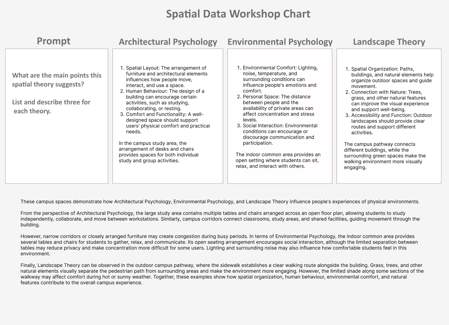
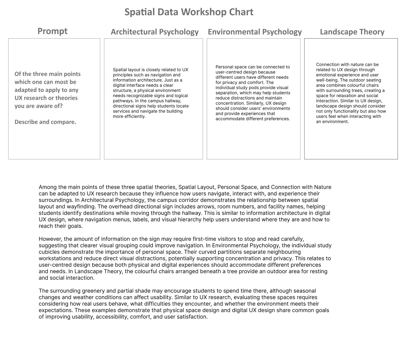
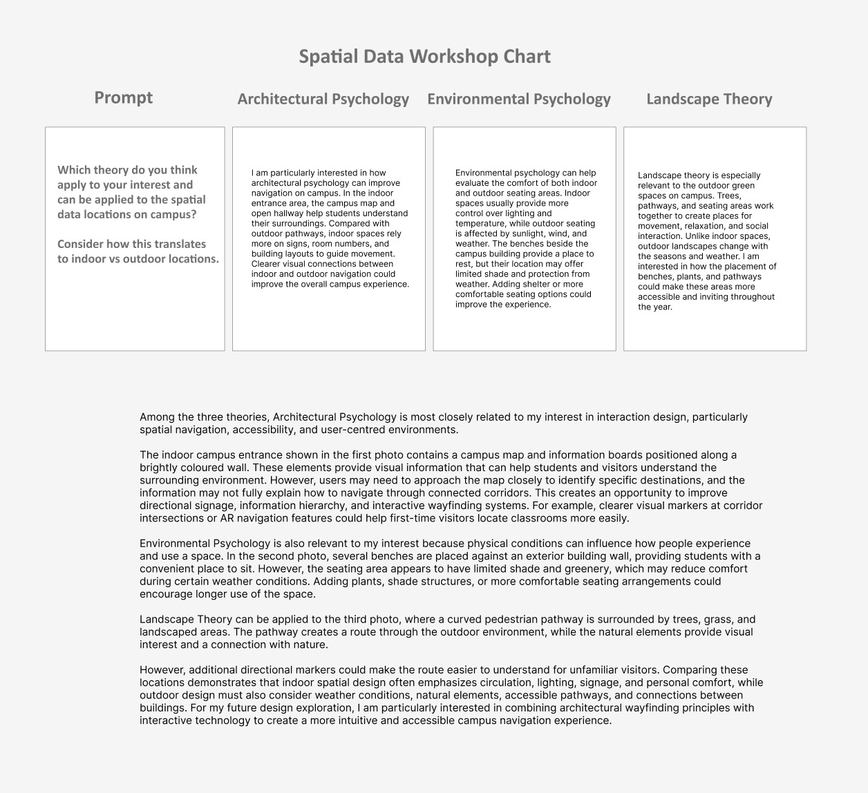
I used three spatial theories to compare a study area, an indoor common area, and an outdoor pathway at Sheridan. The study area’s layout supports both independent and group work, while open seating in the common area makes it easier to socialize but offers less privacy. Outdoors, the sidewalk provides a clear route between buildings, and the surrounding greenery helps define its edges. These observations led me to ask where students can move easily, find a place to pause, or get some quiet.</p></a> I compared three campus features with concepts from UX design. An overhead sign uses arrows, room numbers, and labels to guide students through a hallway, much like a navigation menu helps users find their way through an interface. The curved partitions between study desks show how design can support different needs for privacy and focus. Outdoors, colourful chairs beneath a tree show how seating and shade can shape where students choose to relax or socialize. These examples helped me connect wayfinding, user needs, and comfort to both physical and digital design.'></div> Of the three spatial theories, architectural psychology connects most closely to my interest in accessible wayfinding. At Sheridan’s indoor entrance, the campus map gives visitors an overview, while clearer signs at corridor intersections could help them decide where to turn. The outdoor benches made me consider how shade and weather affect where students choose to sit. The curved, tree-lined path showed me how landscaping can guide movement outdoors. Comparing these spaces helped me think about how to make the transition from outdoor paths to indoor destinations easier to navigate.

Spatial Workshop 2

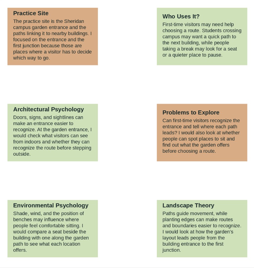
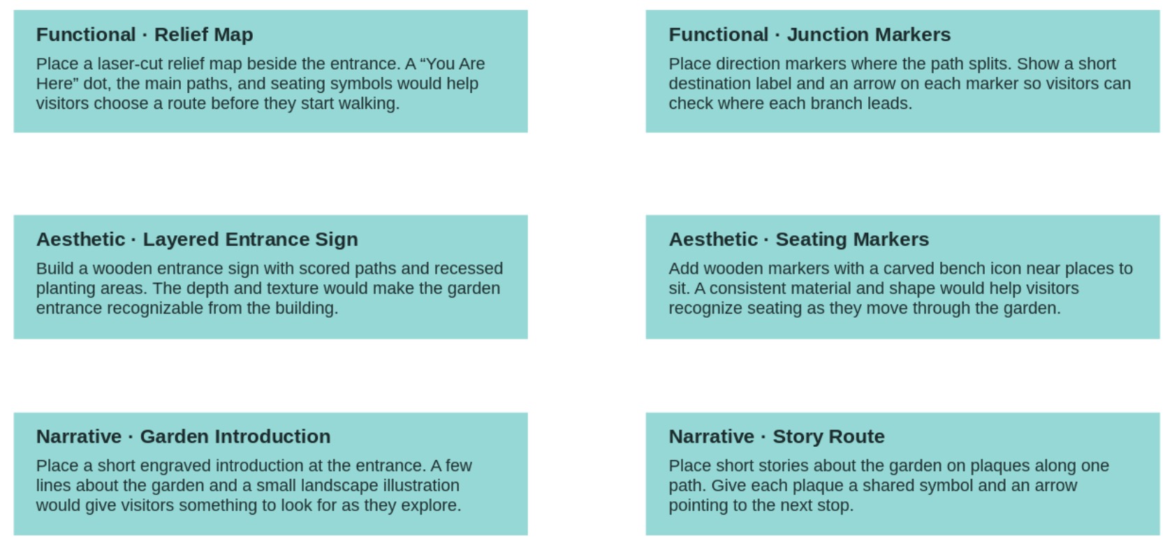
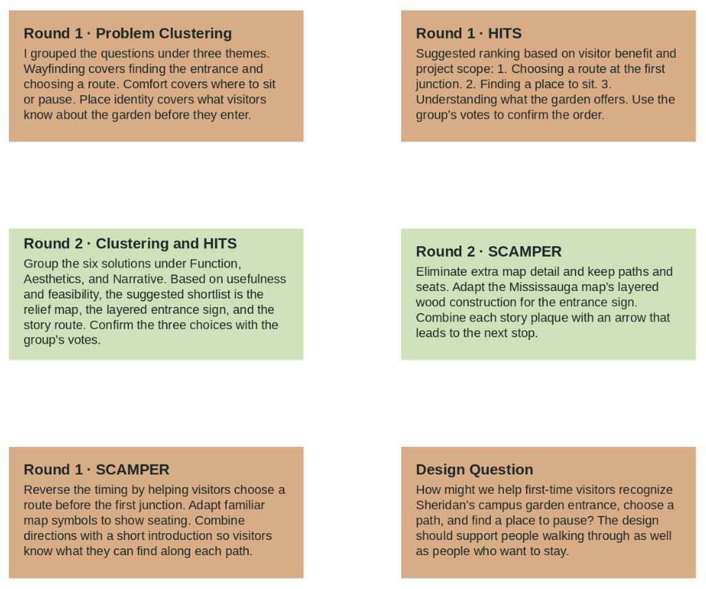
I focused on the entrance to Sheridan’s campus garden and the first junction beyond it. First-time visitors may need help recognizing the entrance and choosing a path, while students passing through or taking a break may look for different things. Architectural psychology helped me consider what visitors can see from the building. Environmental psychology drew my attention to shade and seating, and landscape theory helped me look at how paths and planting edges guide movement. Together, these perspectives helped me identify two questions to explore: how people find their way and how they recognize places to pause.</p></a> I brainstormed six ideas across three categories: function, aesthetics, and narrative. The relief map and junction markers give visitors directions at different points in their walk. The layered entrance sign and wooden seating markers use material, texture, and recognizable shapes to make important features easier to spot. The engraved introduction and story plaques give visitors a reason to stop and explore. Comparing the six ideas helped me think about what someone might need at the entrance, at a junction, or farther along the path.</iframe></div> In the first round, I grouped the problems into wayfinding, comfort, and place identity. I proposed prioritizing the first junction because it is where visitors need to choose a route. Using SCAMPER, I explored moving that decision earlier by giving visitors enough information at the entrance to choose a path before they reach the fork.

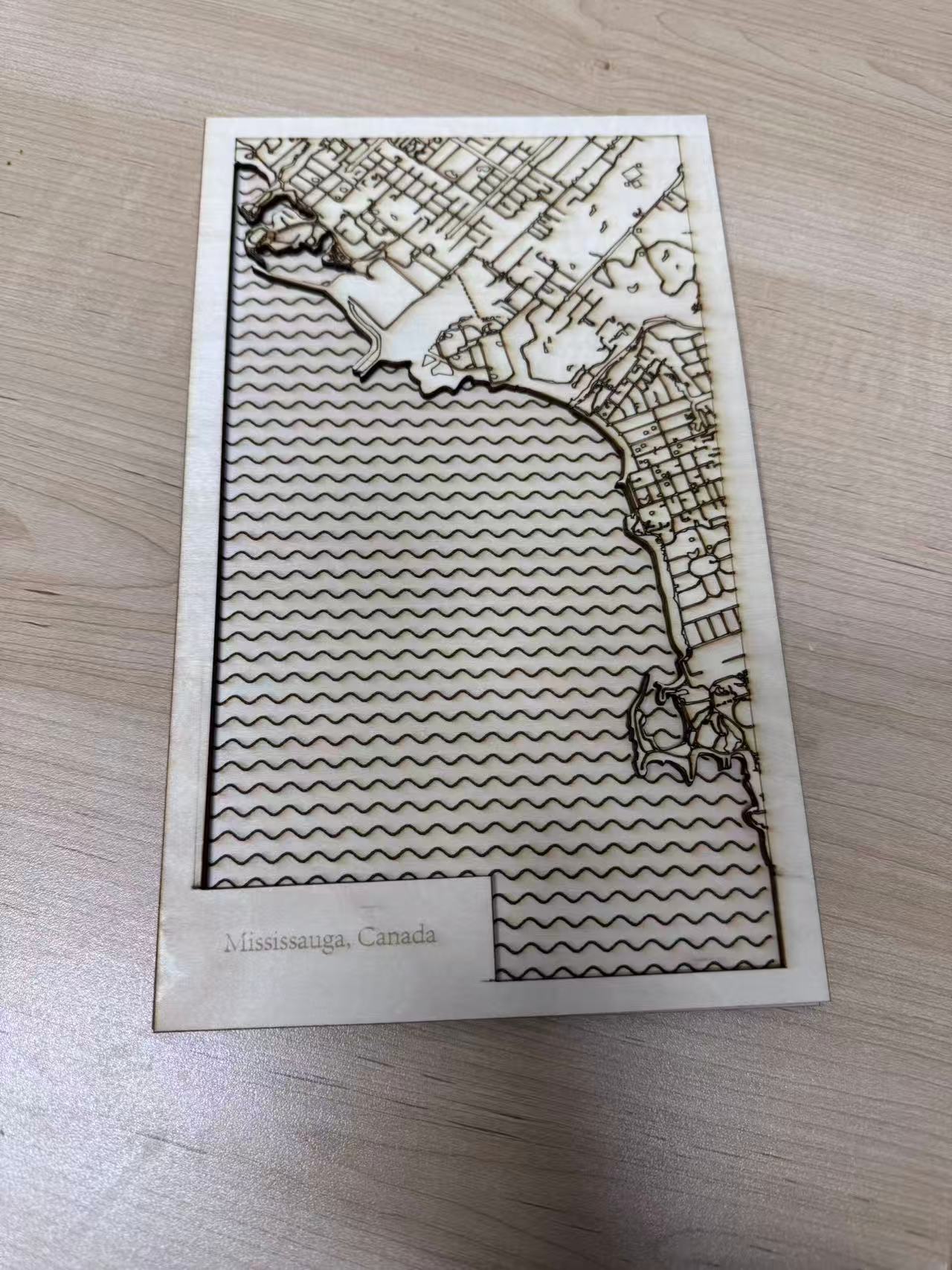
In the second round, I proposed three ideas to develop further based on their usefulness and feasibility. I simplified the relief map to emphasize paths and seats, adapted the layered wood construction from my Mississauga laser-cut map for the entrance sign, and paired each story plaque with a direction cue. Each proposal gives visitors information at a different point in their walk through the garden.

Project 2


Final Project 2 Design

I created a layered wooden map of the Mississauga waterfront to show how the street network, shoreline, and water relate to one another. I wanted the shoreline to be the first feature viewers noticed, with the streets and buildings becoming visible as they looked closer. To create that reading order, I used changes in depth, line weight, and texture.

The outer frame holds the composition together and leaves space for the “Mississauga” nameplate. The upper layer shows the land, with scored lines for streets and small rectangular shapes representing buildings. The cut shoreline exposes the engraved wave pattern on the layer below. That change in height makes the edge between land and water visible, while the waves give the water a texture distinct from the street network.

During fabrication, I learned how the choices I made in Illustrator affected the result in wood. In one test, the small gaps between the wave segments meant that the machine traced their outlines without filling the interiors as I intended. I rebuilt the waves as continuous, closed vector shapes so they could be engraved as filled forms. For the nameplate, I converted the lettering to vector outlines so the laser software could read the letter shapes. This project taught me to think about “score, fill, and cut” as three ways of communicating information. Scoring preserves fine details such as streets, filled engraving gives the water a consistent visual texture, and cutting creates the physical edge of the shoreline. Using those operations together let me make the map readable at two scales.
×

Powered by w3.css